A matter of taste and choice – Episode 7
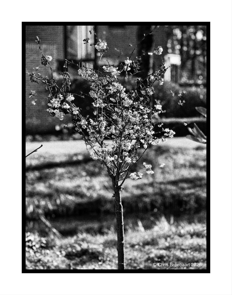
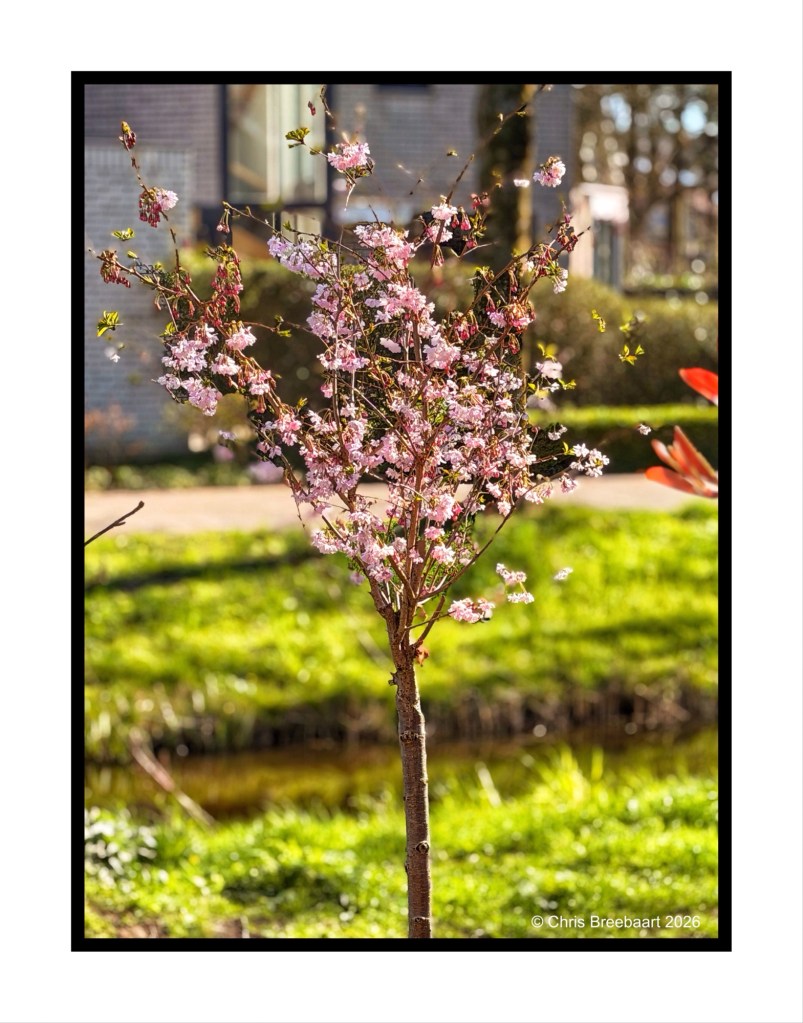
This week’s theme #390 is ‘color in black and white’. The theme focuses on the cognitive fact that our brains still know a color, even if it is in a grey tone. So the sky is blue, the grass green etc. Here you can see what colors do in greys, and if that is appealing or not to your taste pallet. For me this challenge is a bit of fun: most of the time I am looking at the world translating colors straight into grey tones, seeing if a photo is working in monochrome or not. Thanks Egidio for this challenge.
If you visit my blog – like I hope you do or from now start to do – you must have recognized my ‘old’ love for monochrome. When I started this hobby, mono was fashionable and a standard for news photography. And it was cheaper. In this series I offer you two versions of a photo. And you can prefer one over the other, or not.
Shot with iPhone 17 Pro Max edited using Snapseed and Marksta. Click the picture for a larger version

6 Responses to “A matter of taste and choice – Episode 7”
Chris, this one confuses my brain! In monochrome, the tree doesn’t have enough distinctive tonal quality to stand out. In color, the tree is beautiful, but the background is too busy for the tree to stand out. How about the tree in color on a mono background?
LikeLiked by 1 person
Let me answer the question first: I do not do half half pictures. But your observation is a good one.
LikeLiked by 1 person
I don’t either!
LikeLiked by 1 person
I would agree with Anne Chri s!
LikeLiked by 1 person
You may!
LikeLiked by 1 person
😀
LikeLiked by 1 person