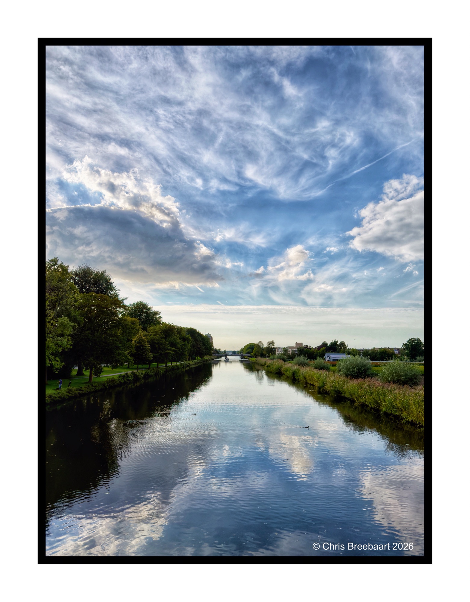
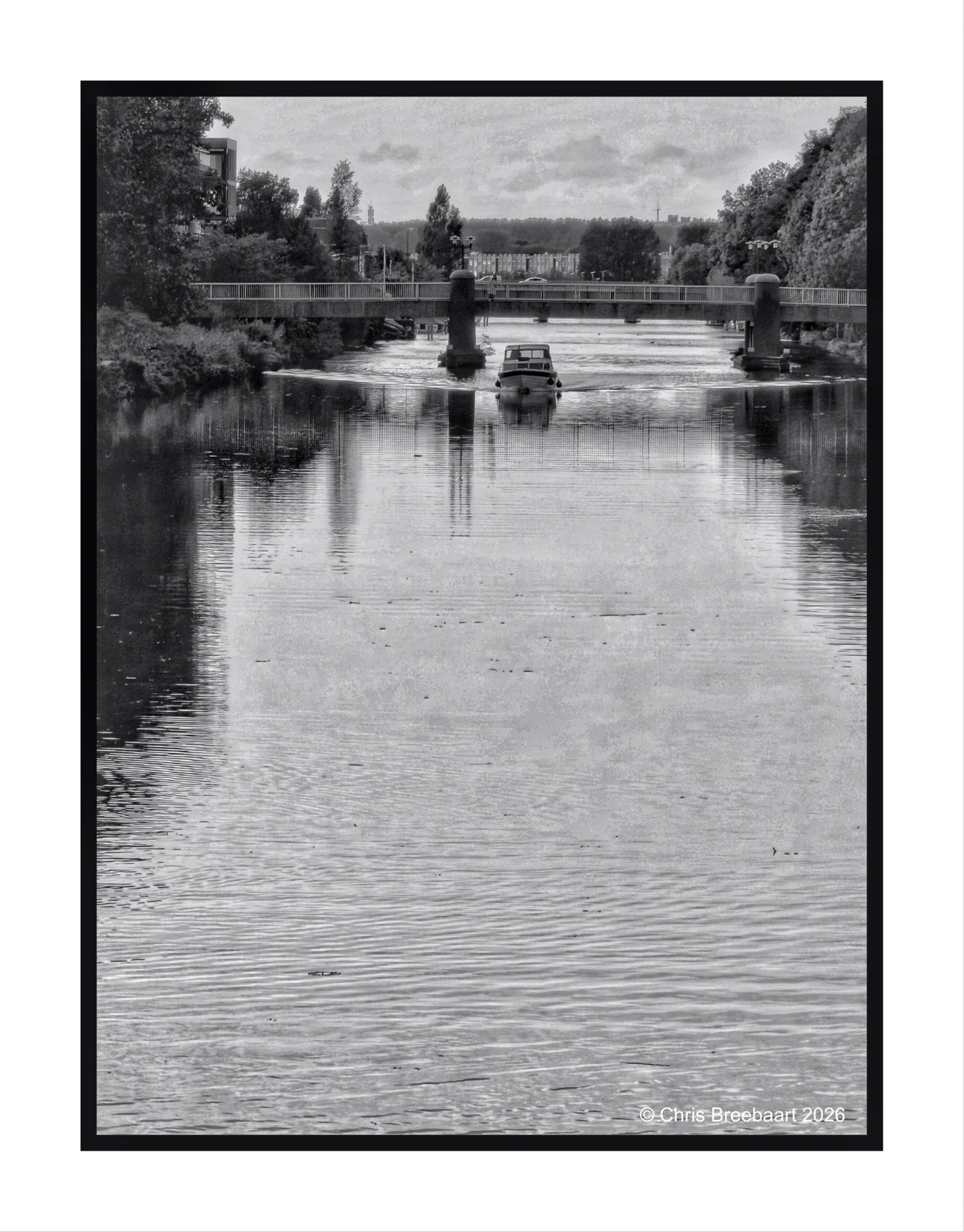
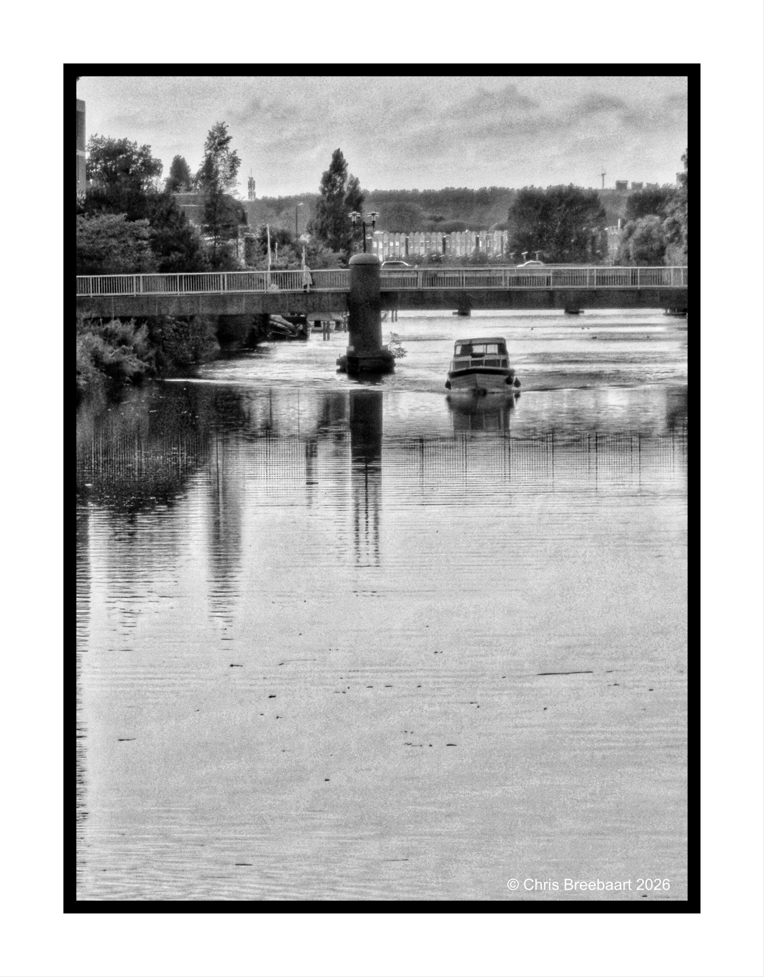
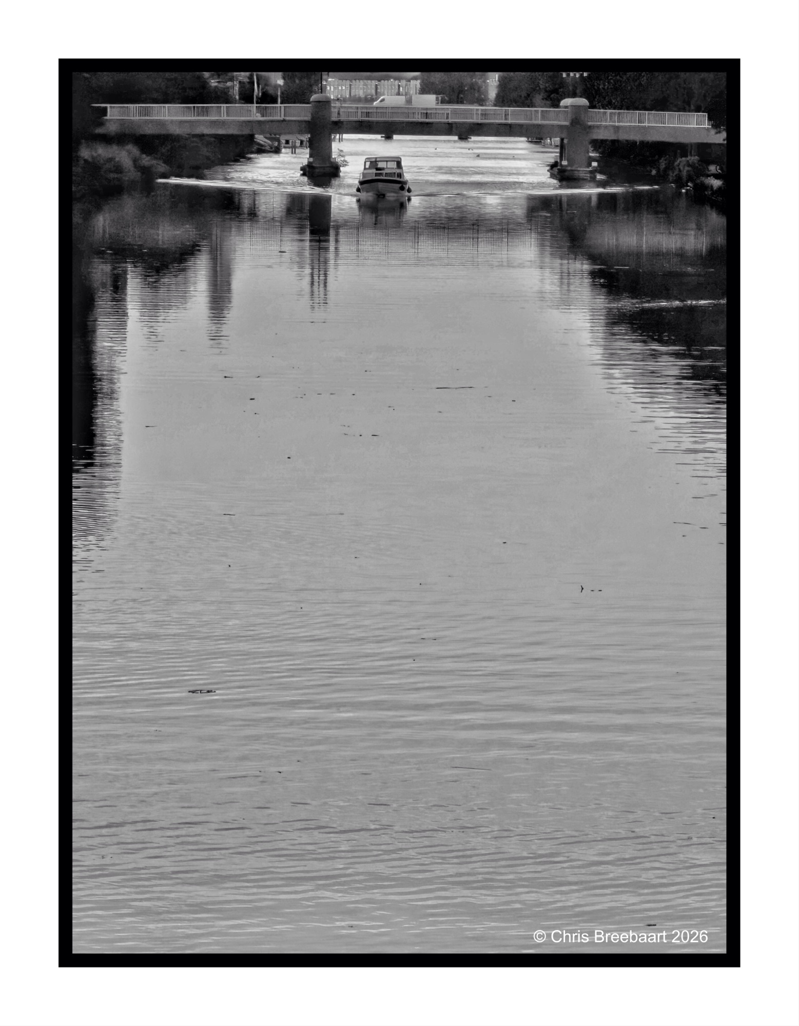
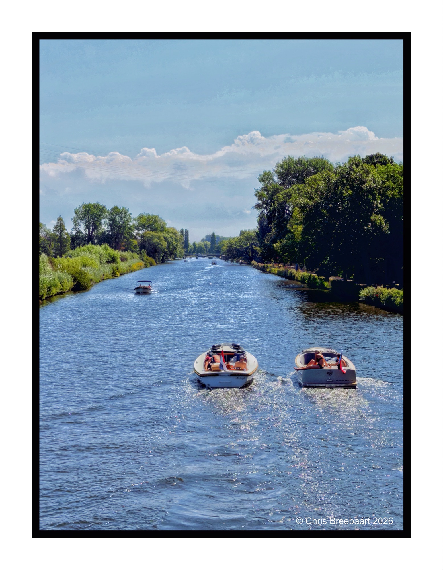
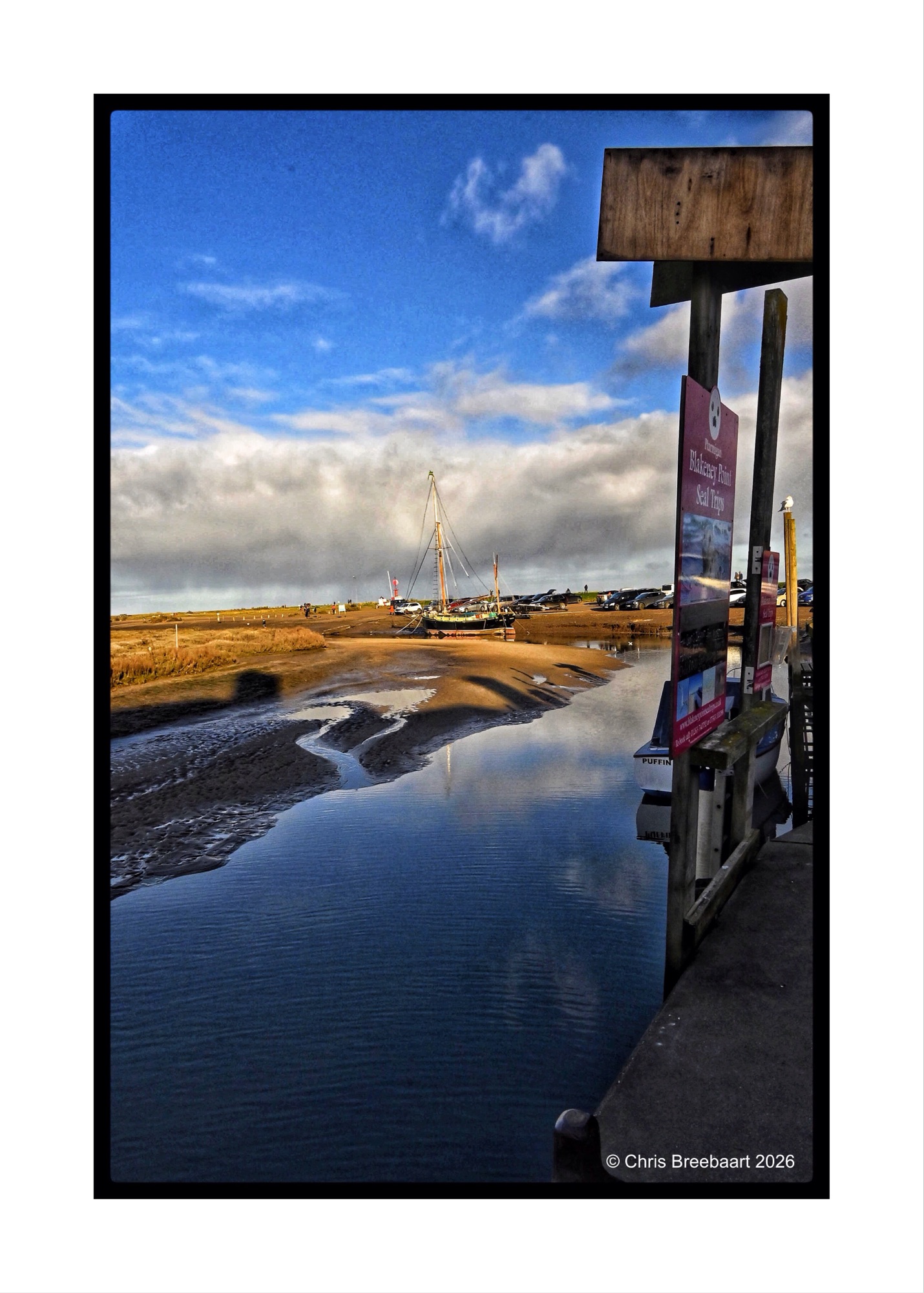
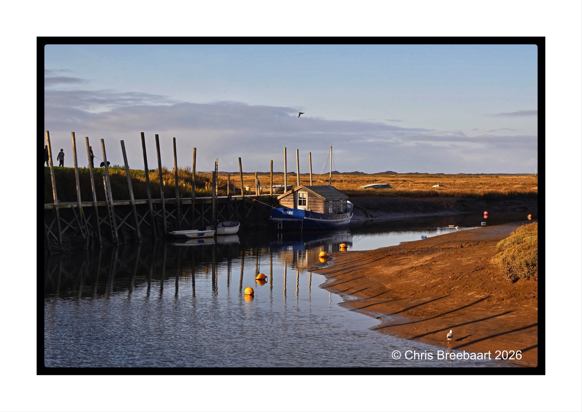
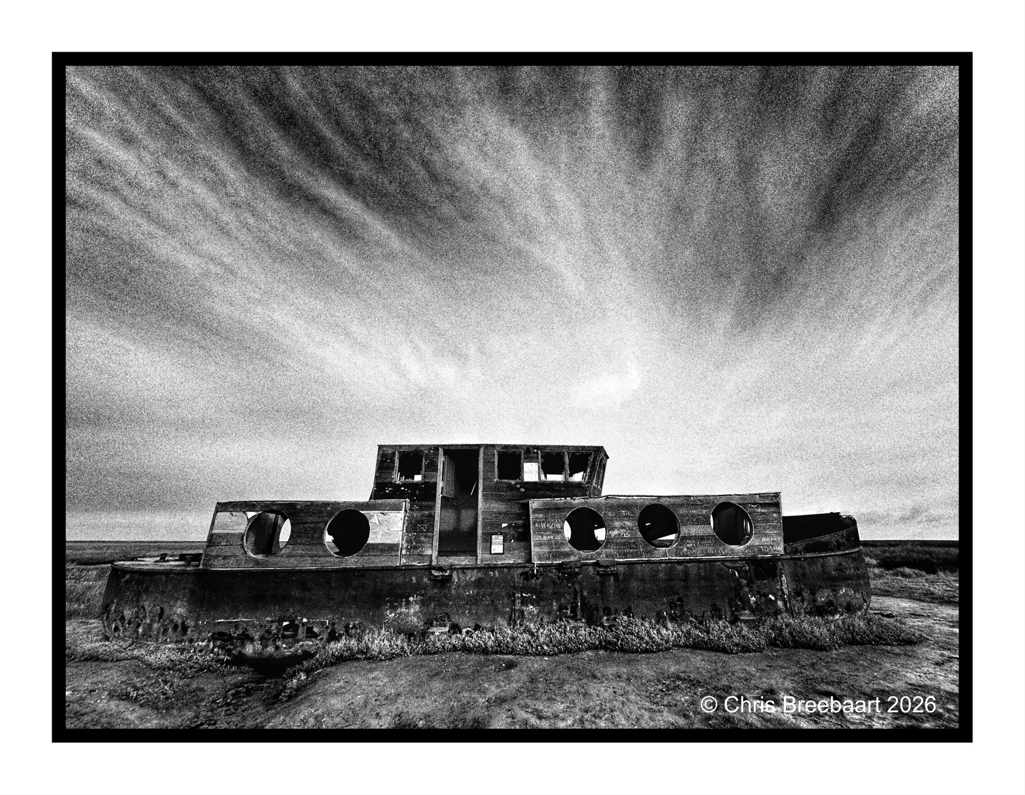
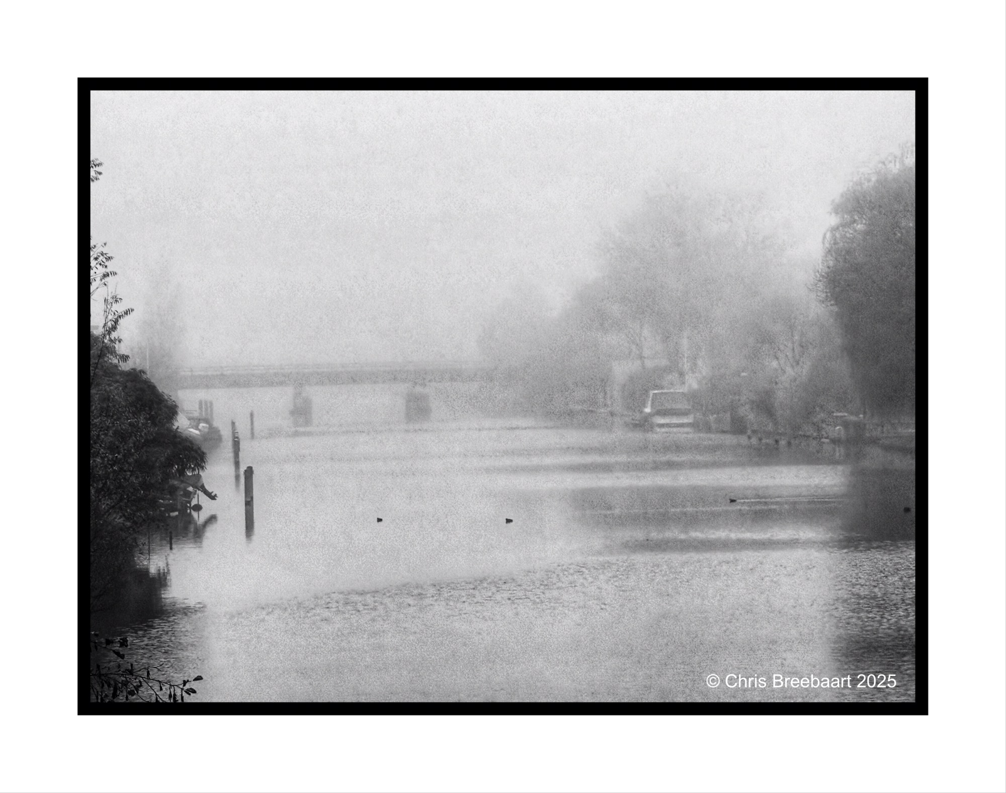
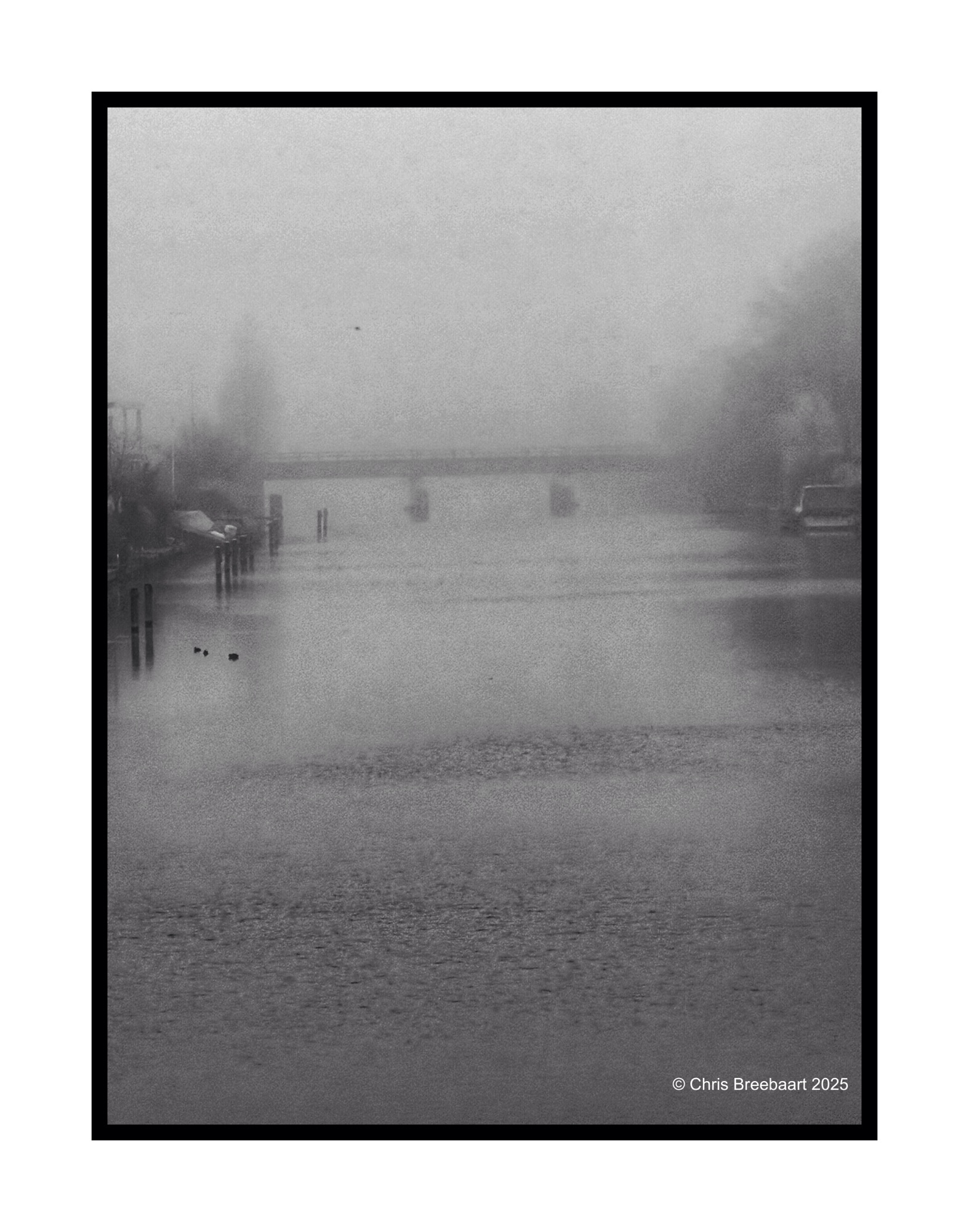
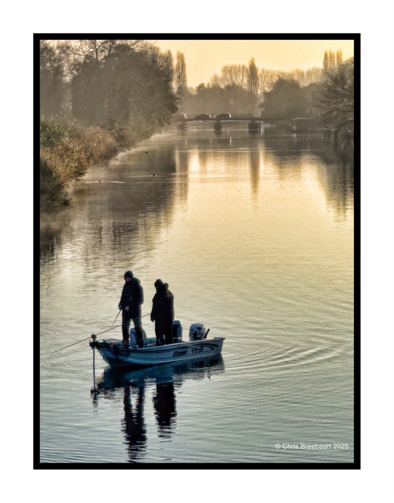
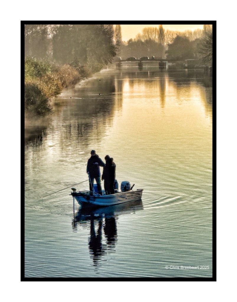
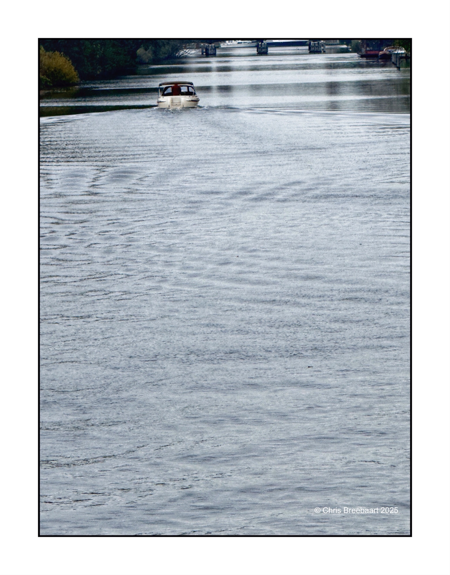
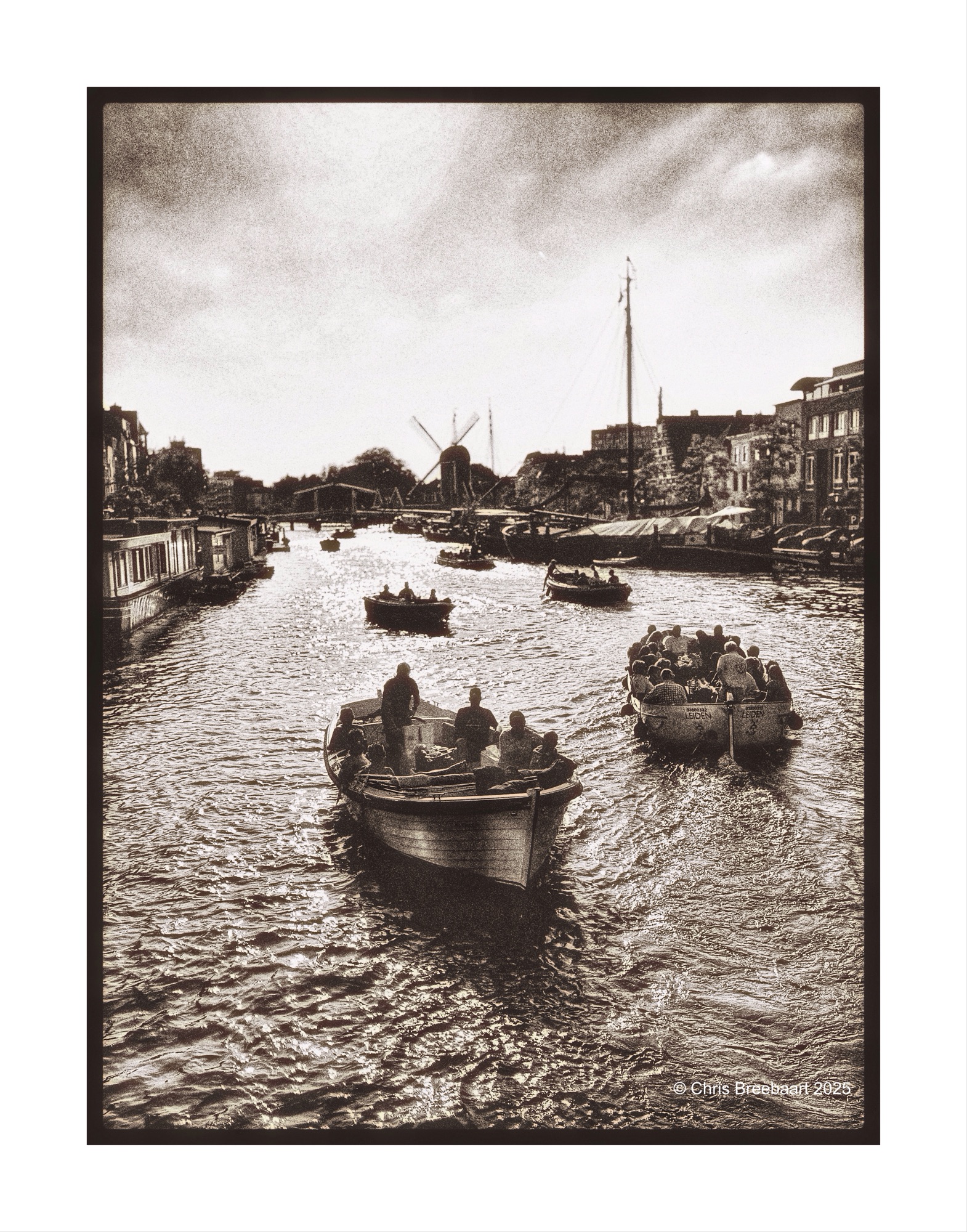
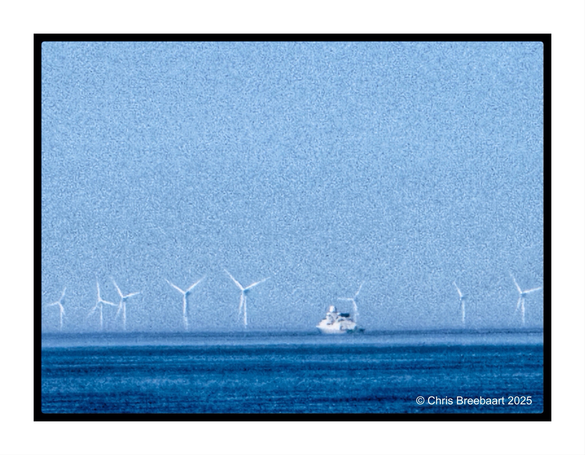
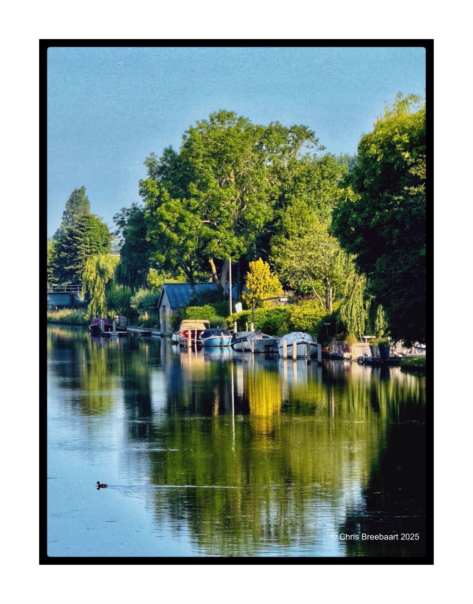
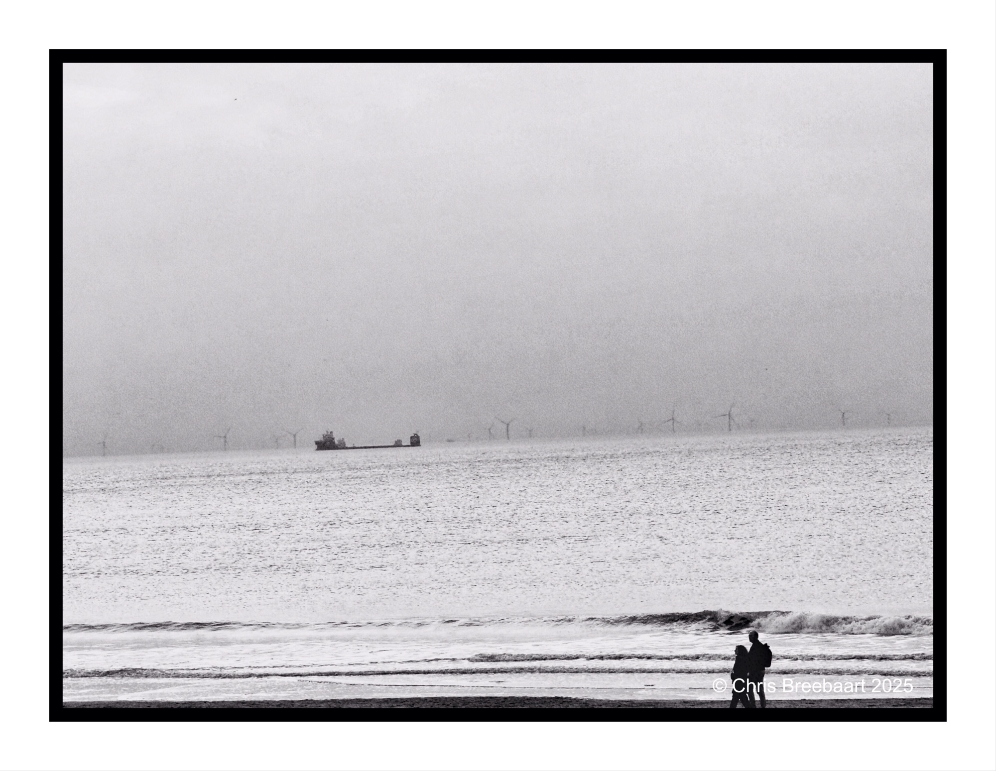
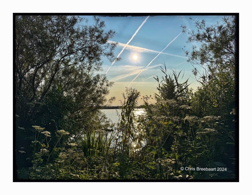
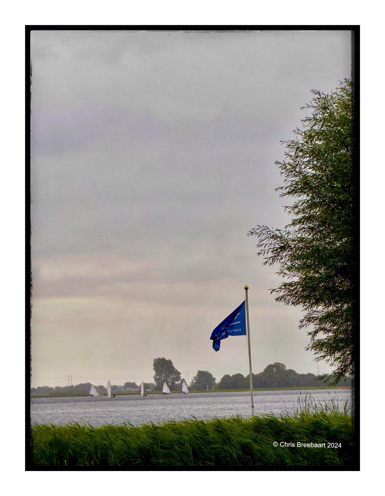
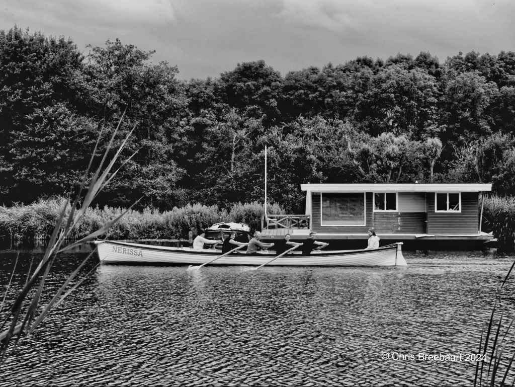
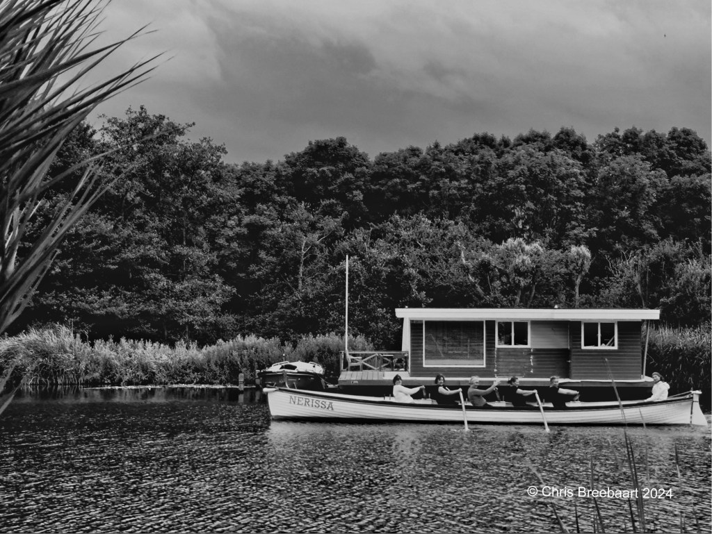
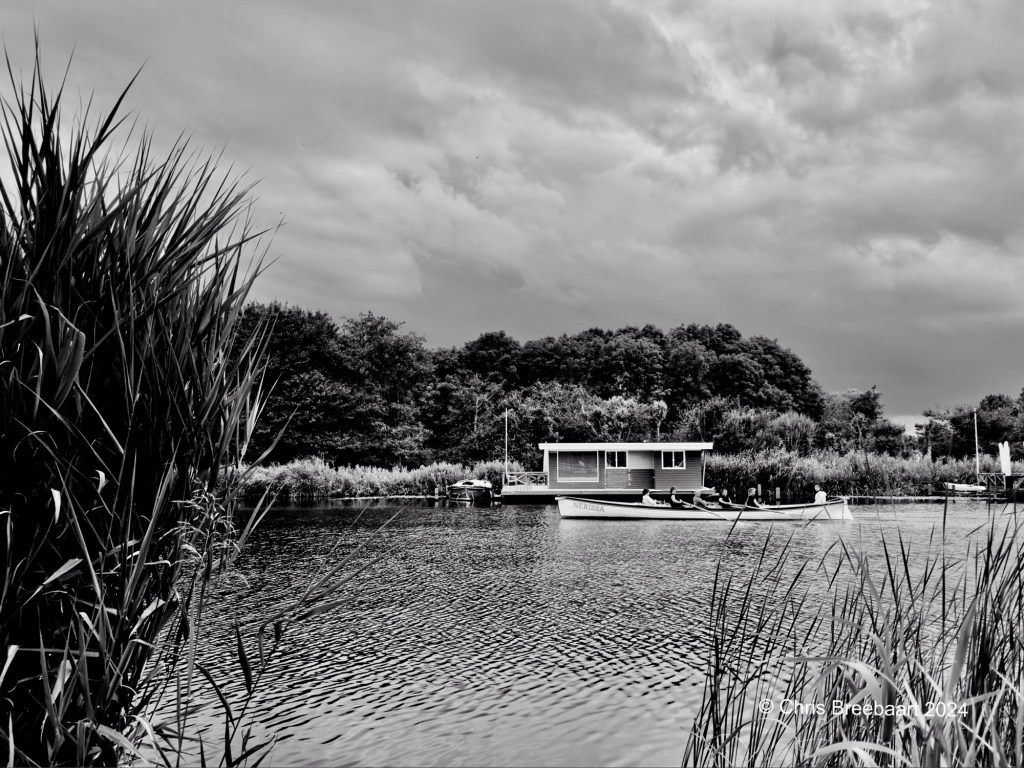
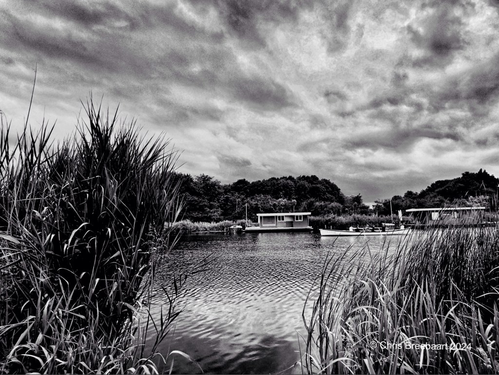
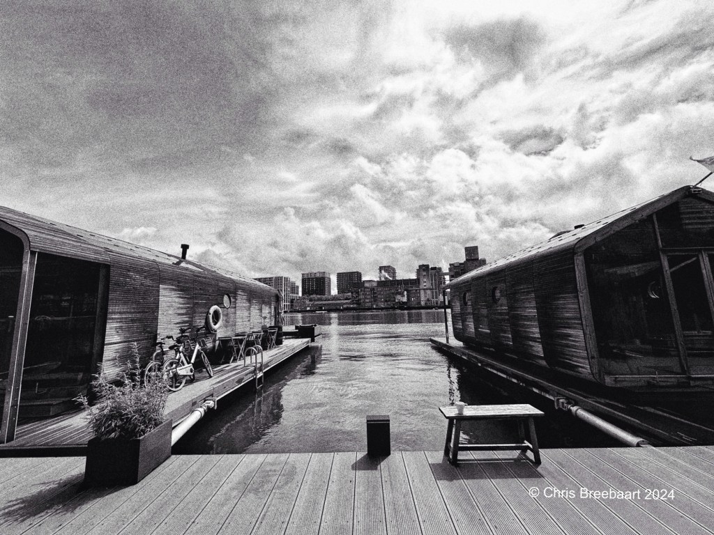
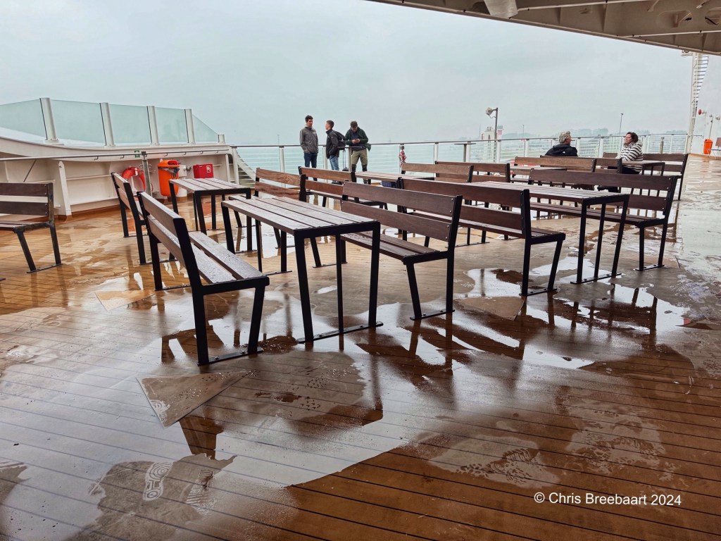
The days before I published photos that I took at the same time as this one. This overview gives you an idea how the previous photos came about, and show you the canal in a different way, to give an idea of the canal, its size and its environment.
A slightly different shot than yesterday. With a bit more of the atmosphere of the canal itself.
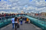
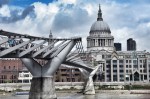
The Netherlands has its fair share of water (canals, lakes, ponds) and a fair share of bridges and even aquaducts. LAPC #413 is ‘bridges’. The two overlapping bridges (behind the front one is a motorway bridge) are not my favourites as the brief of LAPC asks for. They are the most practical in daily life to cross the canal. In the Archive bridges you find more photos of bridges. Most of them are from ordinary daily life close to home. But two of my favourites are the Millennium Bridge in London and the Pont de Normandie in Normandy.
The Netherlands has its fair share of water (canals, lakes, ponds) and a fair share of bridges and even aquaducts. LAPC #413 is ‘bridges’. The two overlapping bridges (behind the front one is a motorway bridge) are not my favourites as the brief of LAPC asks for. They are the most practical in daily life to cross the canal. In the Archive bridges you find more photos of bridges. Most of them are from ordinary daily life close to home. But two of my favourites are the Millennium Bridge in London and the Pont de Normandie in Normandy.
The Netherlands has its fair share of water (canals, lakes, ponds) and a fair share of bridges and even aquaducts. LAPC #413 is ‘bridges’. This two bridges (overlapping) are not my favorites, but with the bridge this one is taken from, the most common I see every day.
One of the first questions I had buying my first digital DSLR was ‘how do I shoot monochrome photos from now?’. In the past it was just choosing what film I put in a camera. Going digital implied using editing to revert from color to monochrome. More recently black and white modes came back on devices. Not only on iPhone. My choice for Nikon Zf was influenced by it. But it all is a question of taste. And taste is specific. When I see a subject nowadays I try to use the monochrome settings and the standard colour settings; knowing that I can nowadays see the results straight away. That is a blessing.
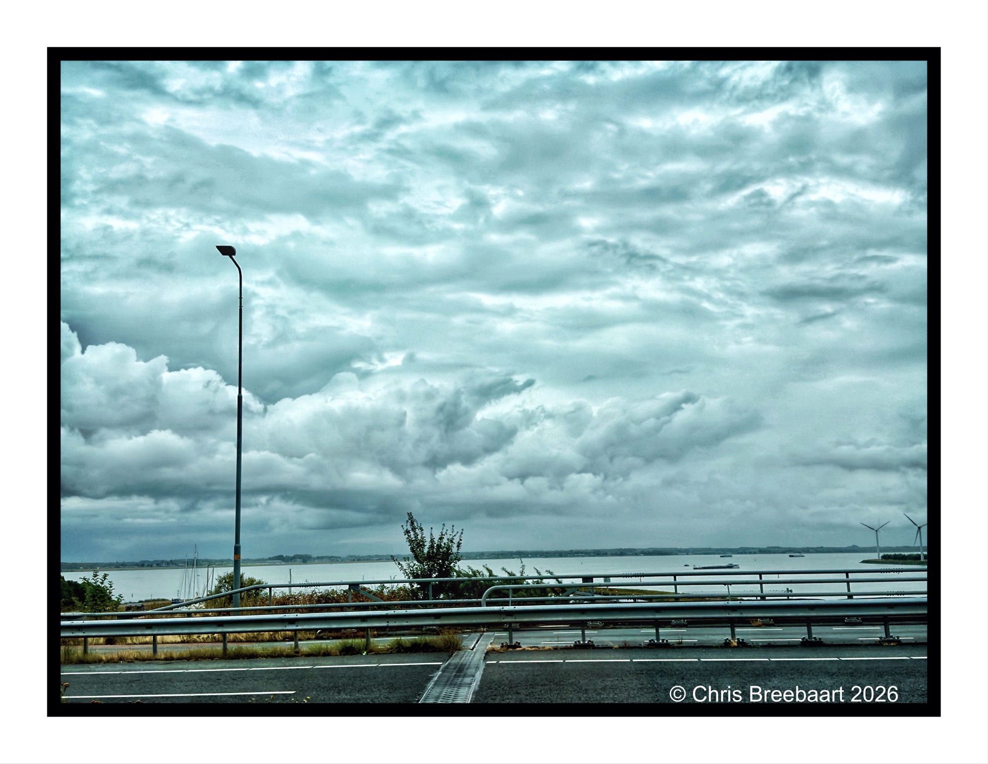
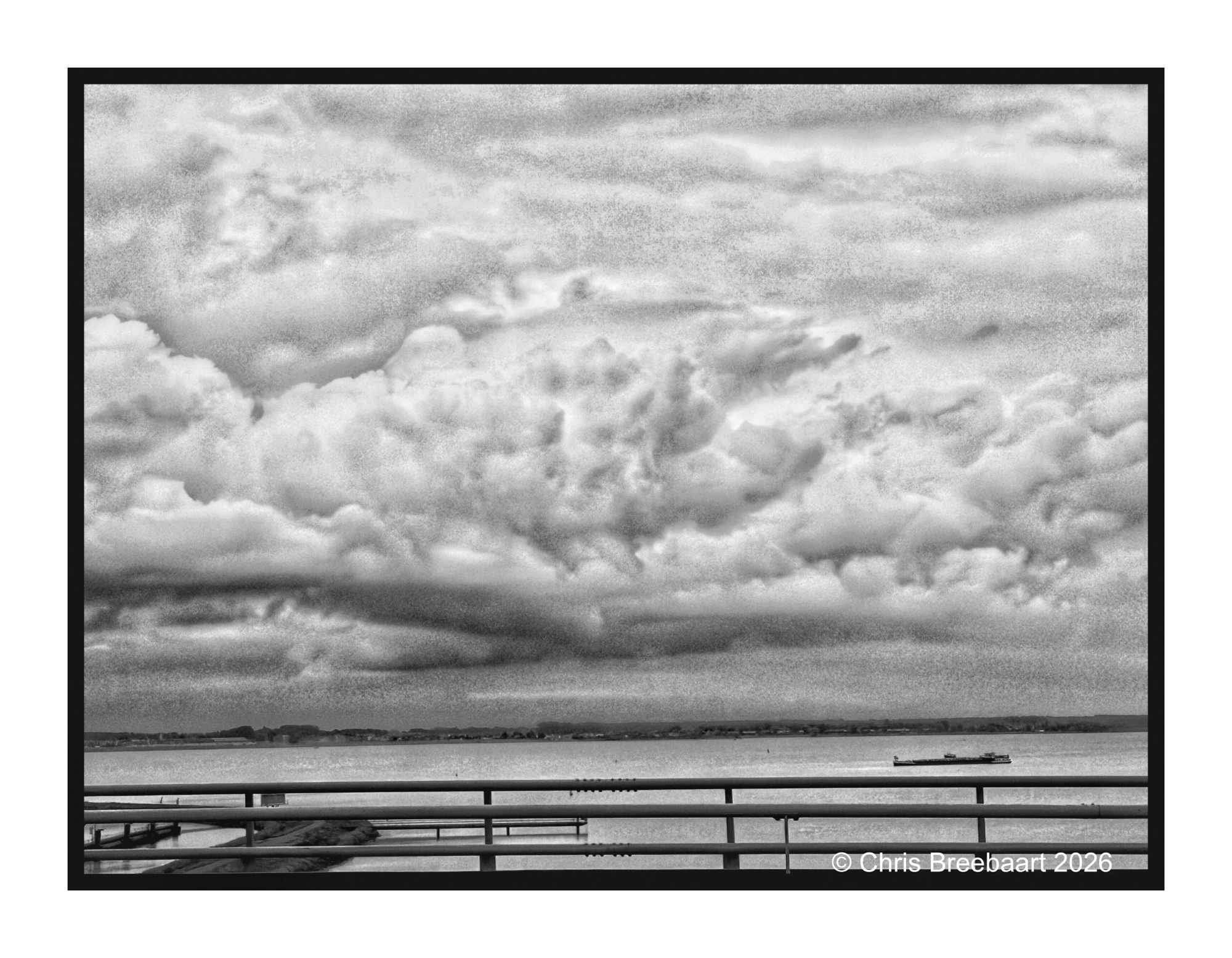
Two different photos of the road over the Volkerakdam. This dam and the locks in it, are part of the Delta Works, safeguarding The Netherlands against floods.
The coast of The Netherlands, showing the colour original of the monochrome of two days ago. The window of the plane gives layer of colors that I did not like at first. Not Australia but from up here it is down under.
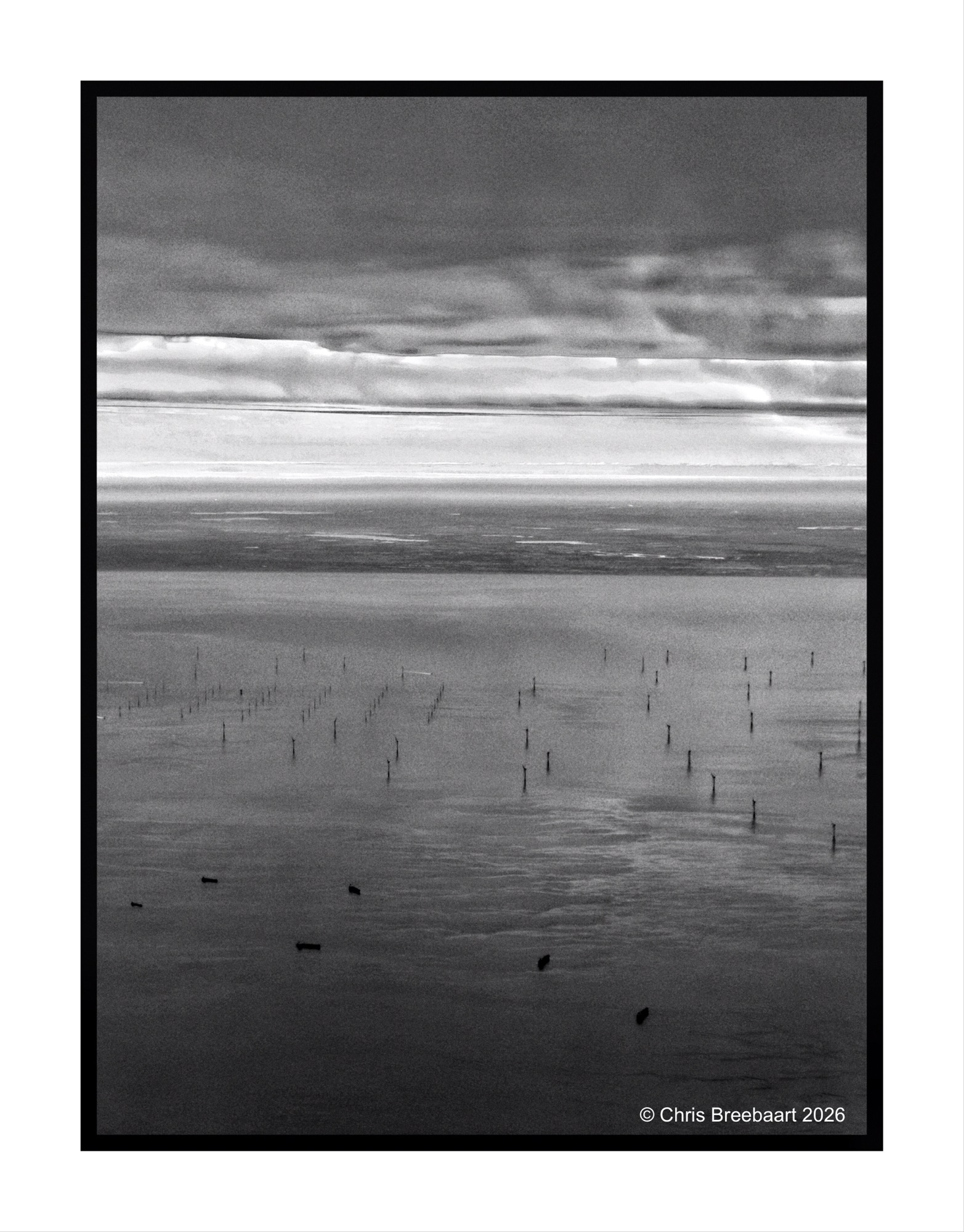
The coast of The Netherlands, showing the Dutch version of Le Plat Pays (my flat country) from an incoming Easyjet flight from London Gatwick to Schiphol Amsterdam. Lots of windmills still.
The theme of LAPC #398 is ‘choose your color’. The brief is to present a photo with a dominant color. Despite being a big fan of monochrome, I do love colors. The fun of colors is their subjectivity; any color has fans and haters. The sense making of colors is as diverse as people are unique. And that’s good. We need colors and images in our life to tell our stories.
So here you can choose between silver and grey. Or both :-).
About the B4 retouch series: I browsed my archive for pictures to publish. Some of them are partly retouched but most do have scratches, dust and stains.Shot with Nikon F90 on Kodak TriX, scanned from film and edited using Snapseed and Marksta. Click the picture for a bigger version
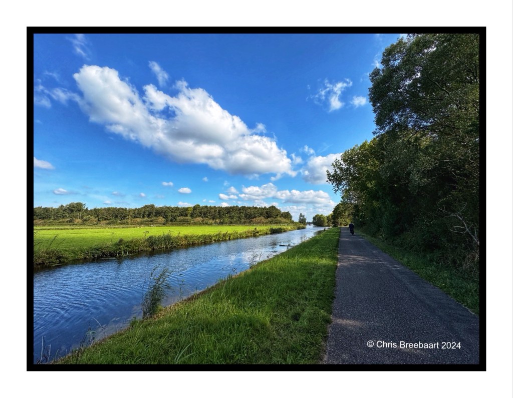
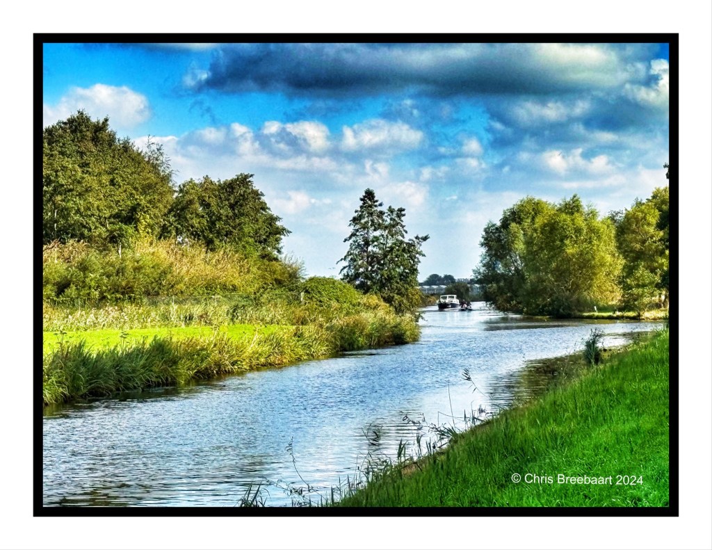
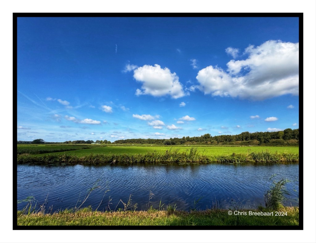
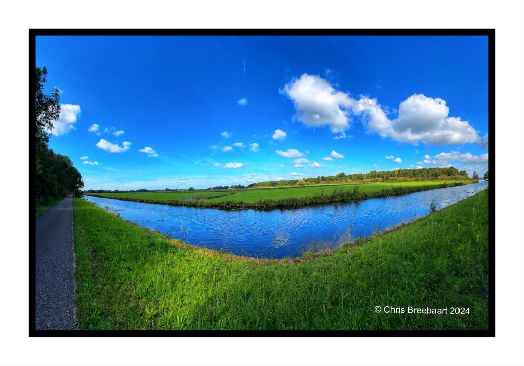
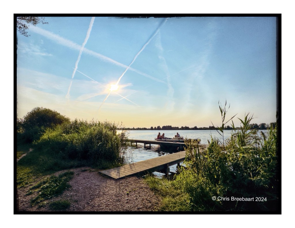
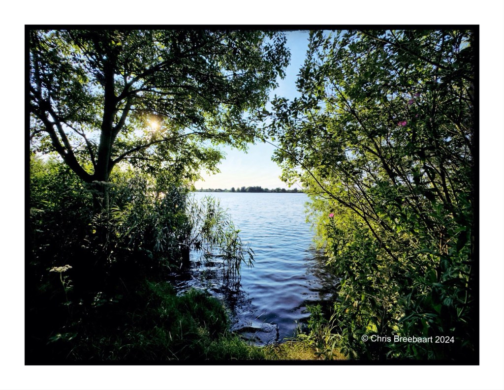
A bicycle tour brought us to the Zijwatering, a canal from Wassenaar to the Oude Rijn (in the time of the Roman Empire the present Old Rhine was part of the Rhine estuary and came into the Northsea at Katwijk). It was a surprise and also a delight to see the beauty of the landscape under a beatiful early Autumn sun. The bottom photo is a panorama, using this feature on the iPhone makes straight lines bend.
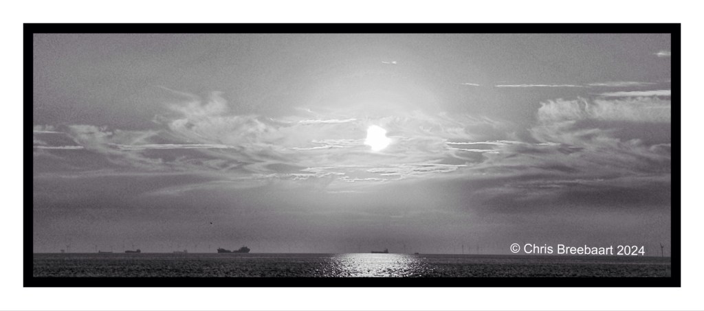
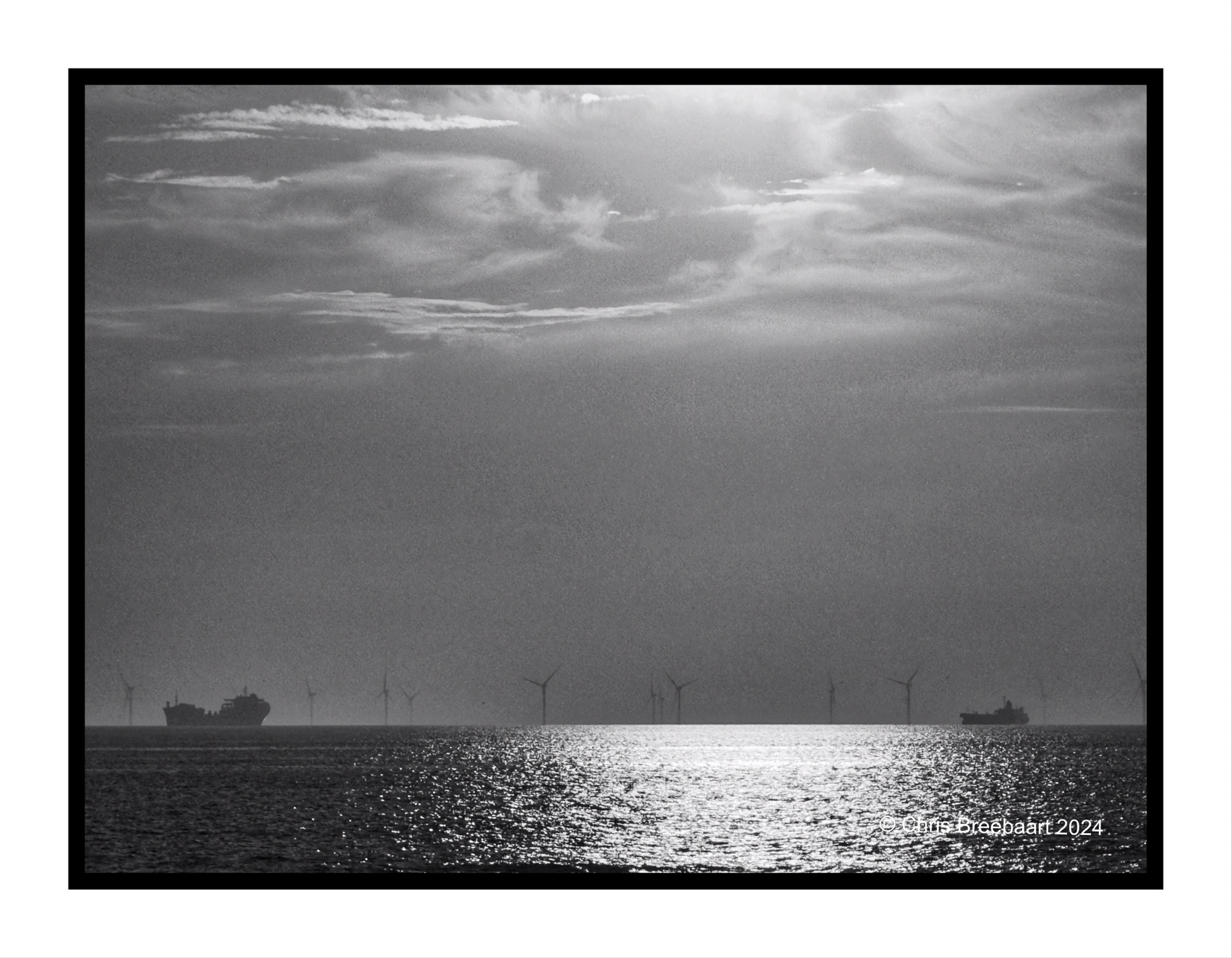
Yesterday I told you about my passion and history in monochrome. And that I do shoot sunsets in black and white. Here is another one of the same sunset, but framed different. I will publish an overview of all those shots of same sunset that evening. Each of them show a bit of it, it’s in my humble opinion nice to see the big picture.
If you did not notice, I am a big fan of monochrome. In fact, monochrome film was way back the medium I started with. It was cheap and you print your own photos in a darkroom. That was adventurous and frustrating at the same time. Not to sound old, but nowadays with wonderful software, editing images is easier, faster and more fun. And you instantly see what you get! But sometimes I do miss the anxiety of the darkroom, seeing a photo come up in the developer. Back to now. I do shoot sunsets in black and white, and here is one. The atmosphere of the shot is different, more dark and eerie.
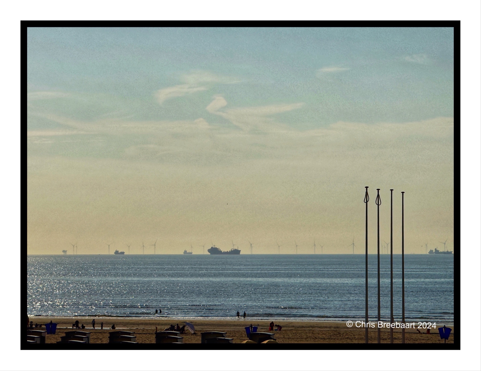
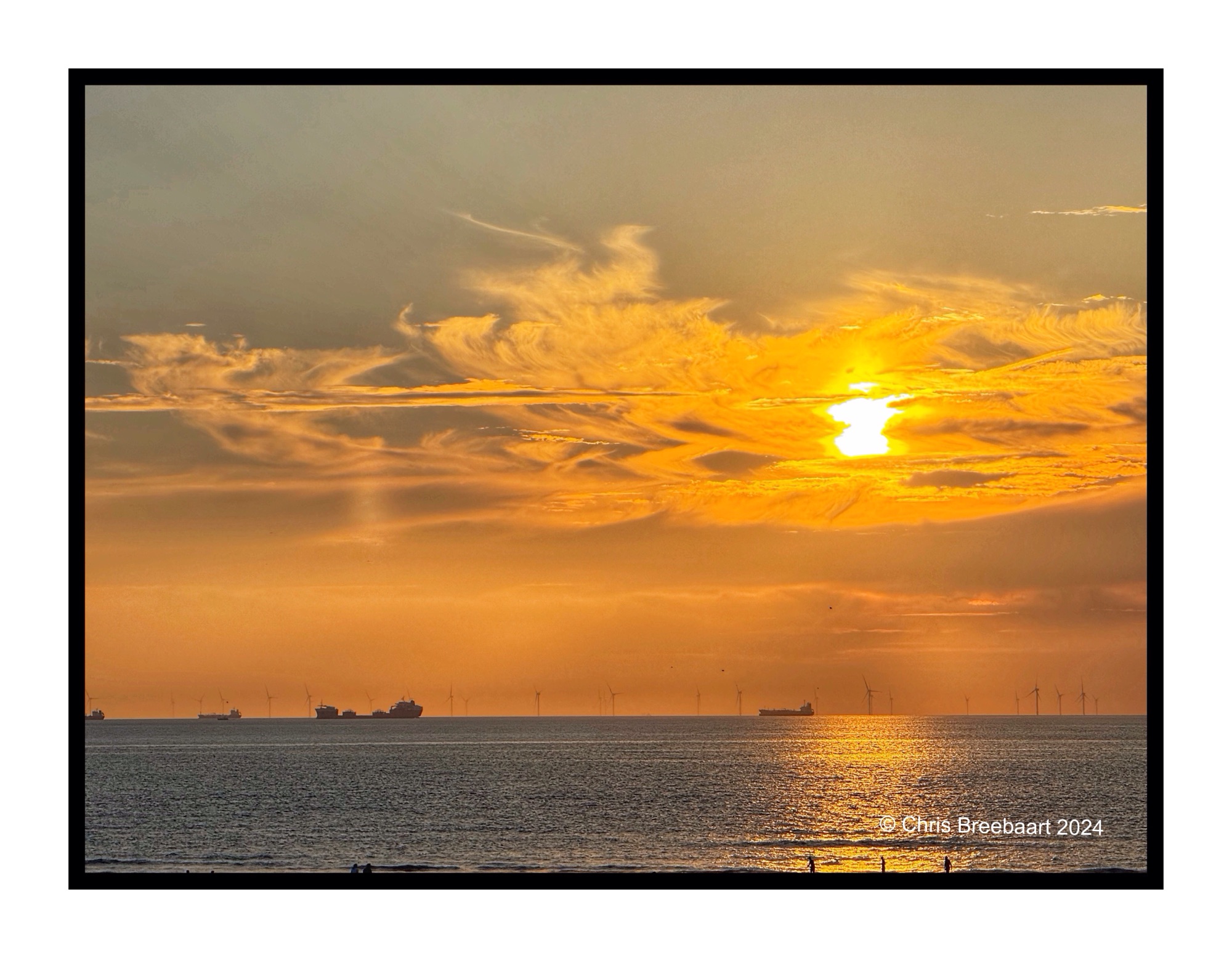
The theme for this week LAPC 314 is ‘shorelines‘. My main shoreline is the beach of the Noordzee. And the views it offers, particularly at special moments of the day like a sunset. The sky looks like it offers an extra layer of reflection for the sun, a second horizon.
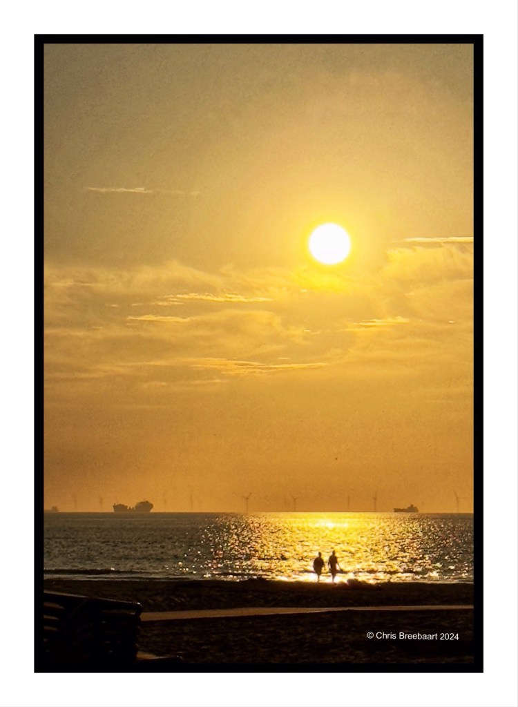
When you are on a spot where you see such a wonderful sunset, it is normal to shoot multiple photos. This couple appeared in a few of the photos already, but each time they are in a shot, it is the framing of a different story as I see it. Maybe you do too. The theme for this week LAPC 314 is ‘shorelines‘.
I pictured a rainbow You held it in your hands I had flashes But you saw the plan I wandered out in the world for years While you just stayed in your room I saw the crescent You saw the whole of the moon The whole of the moon