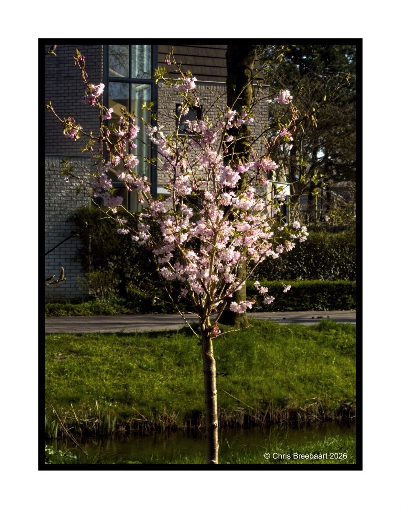
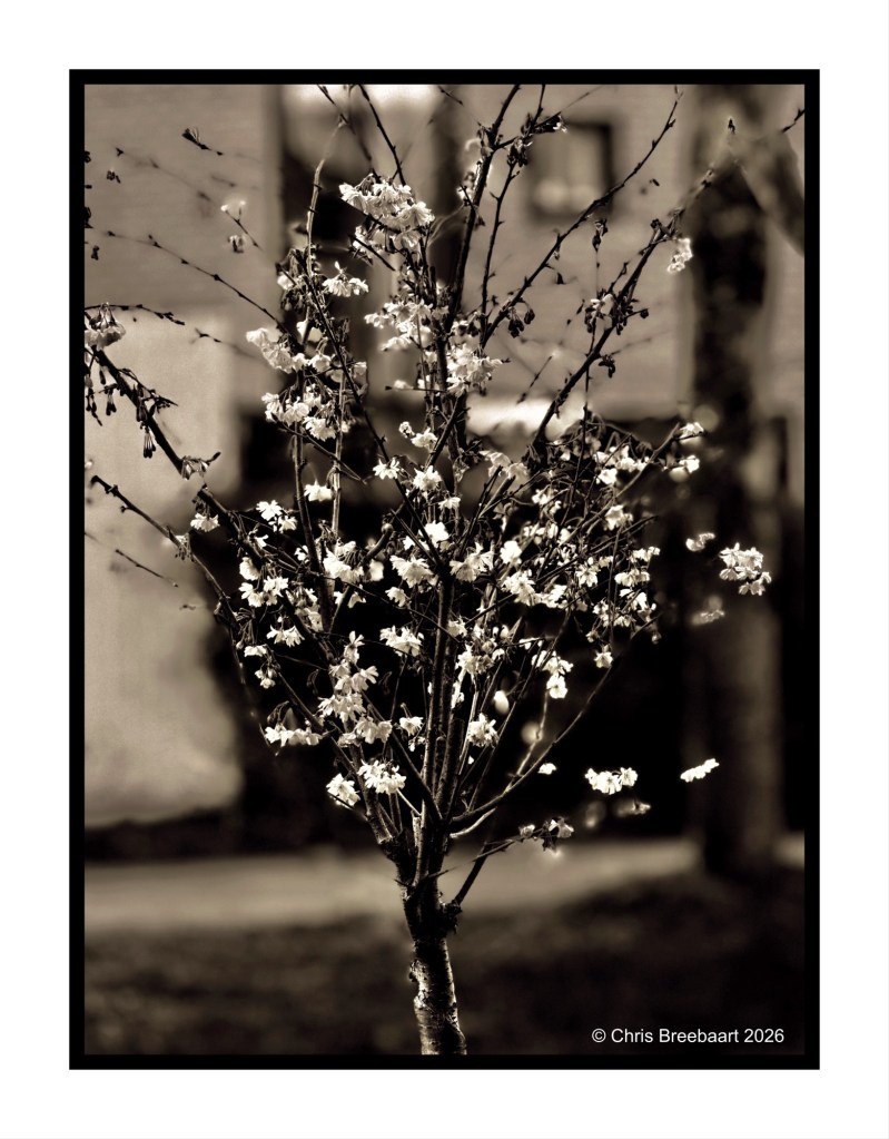
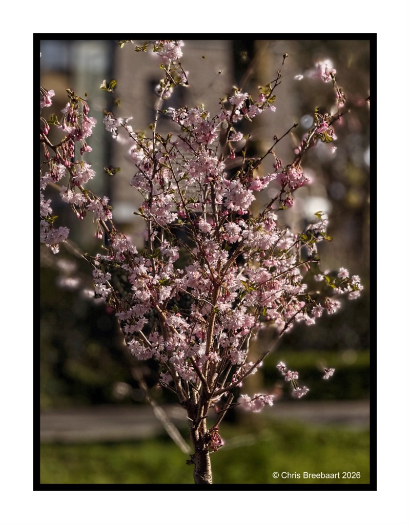
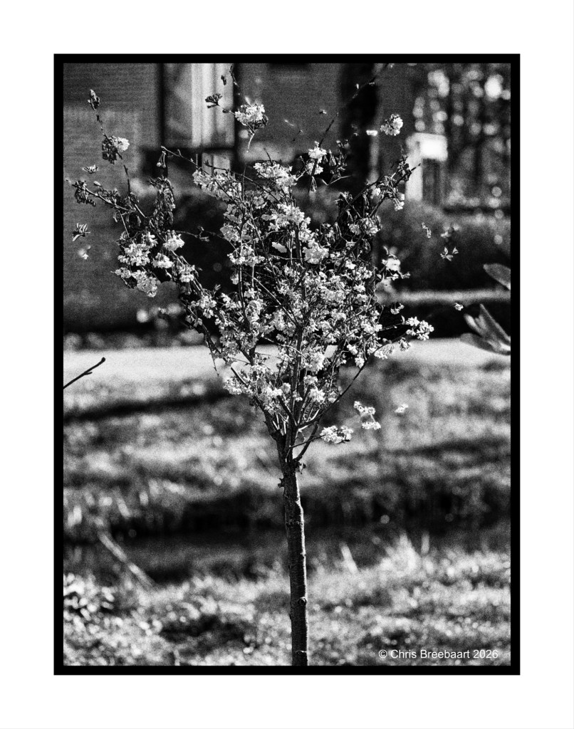
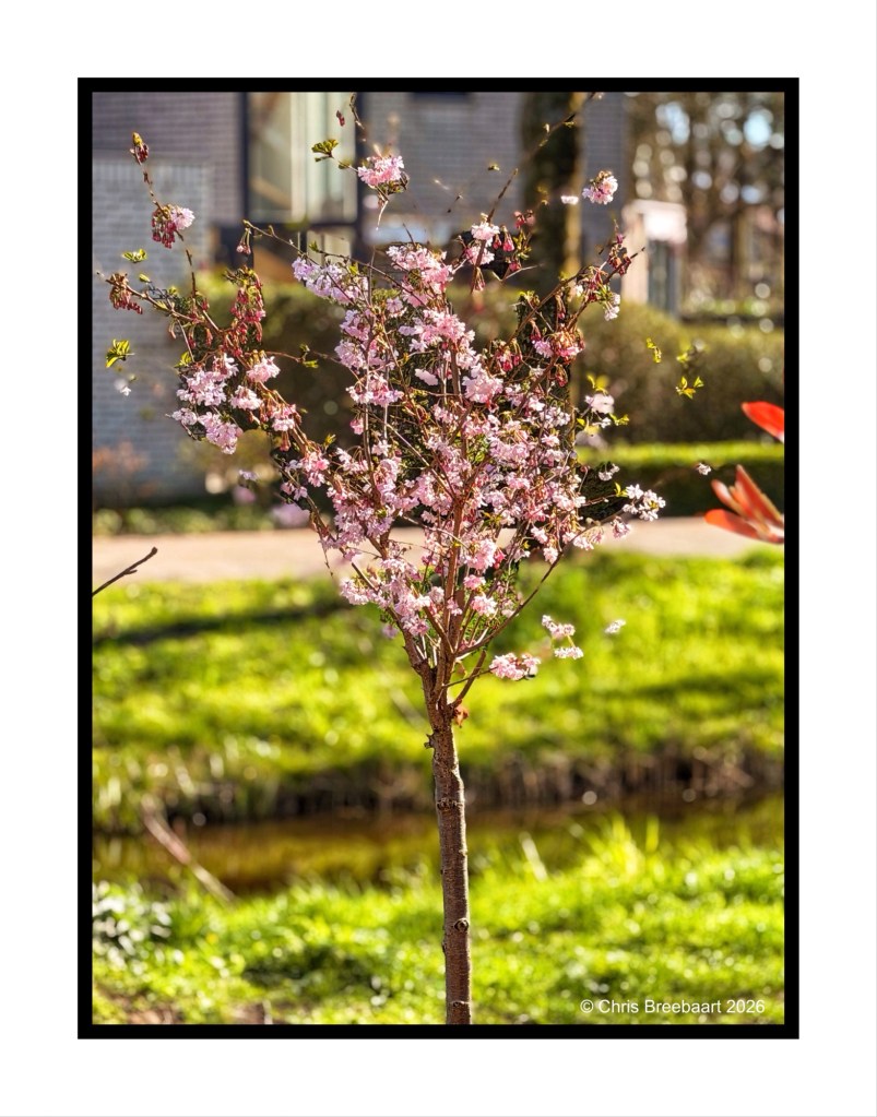
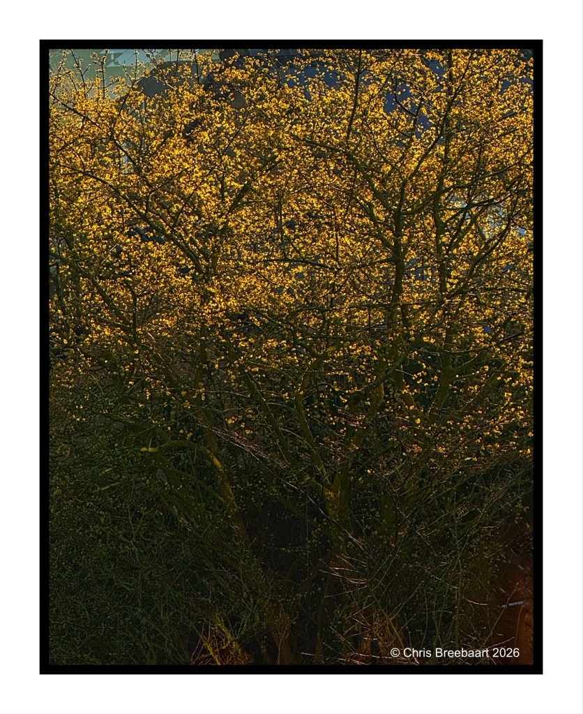
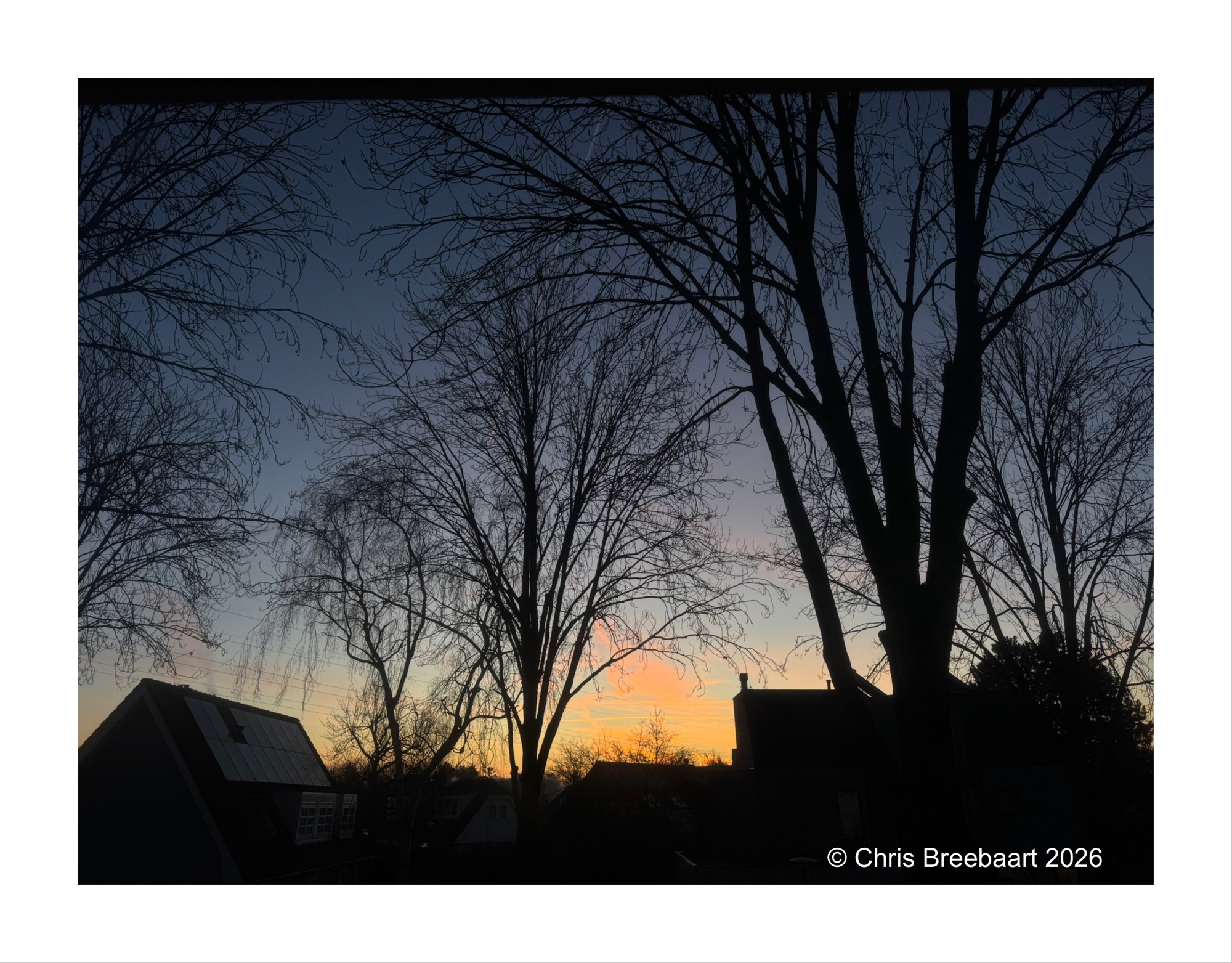
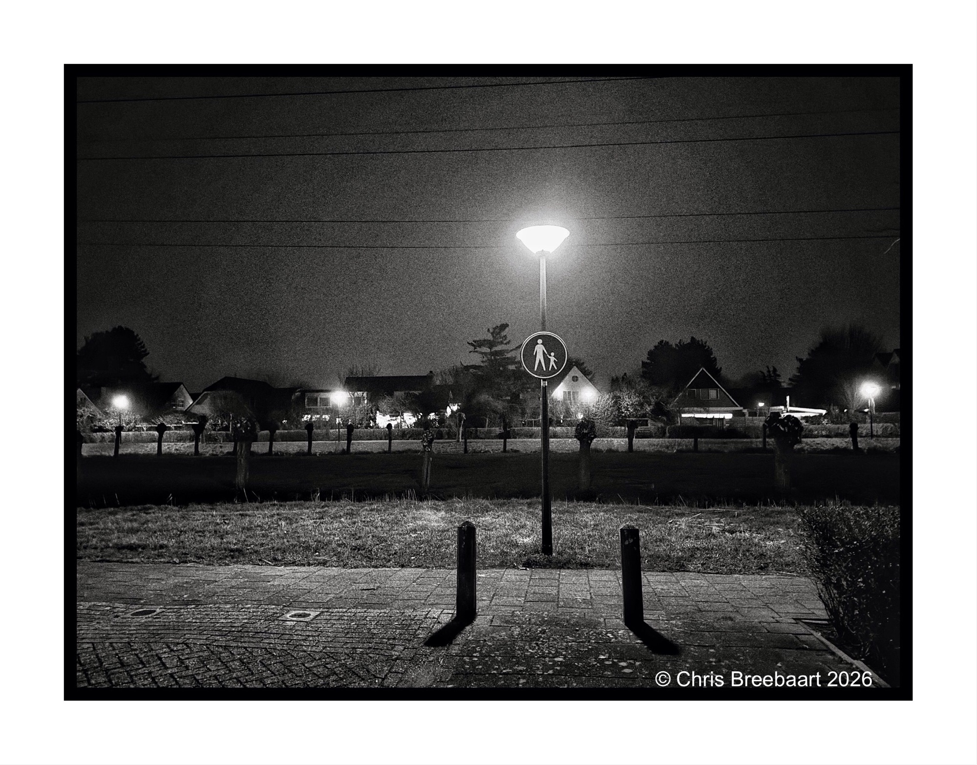
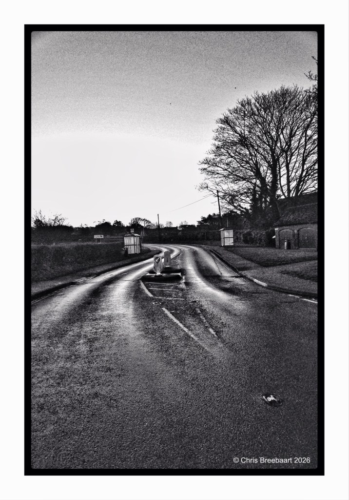
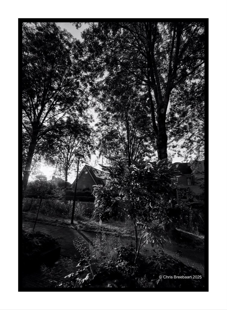
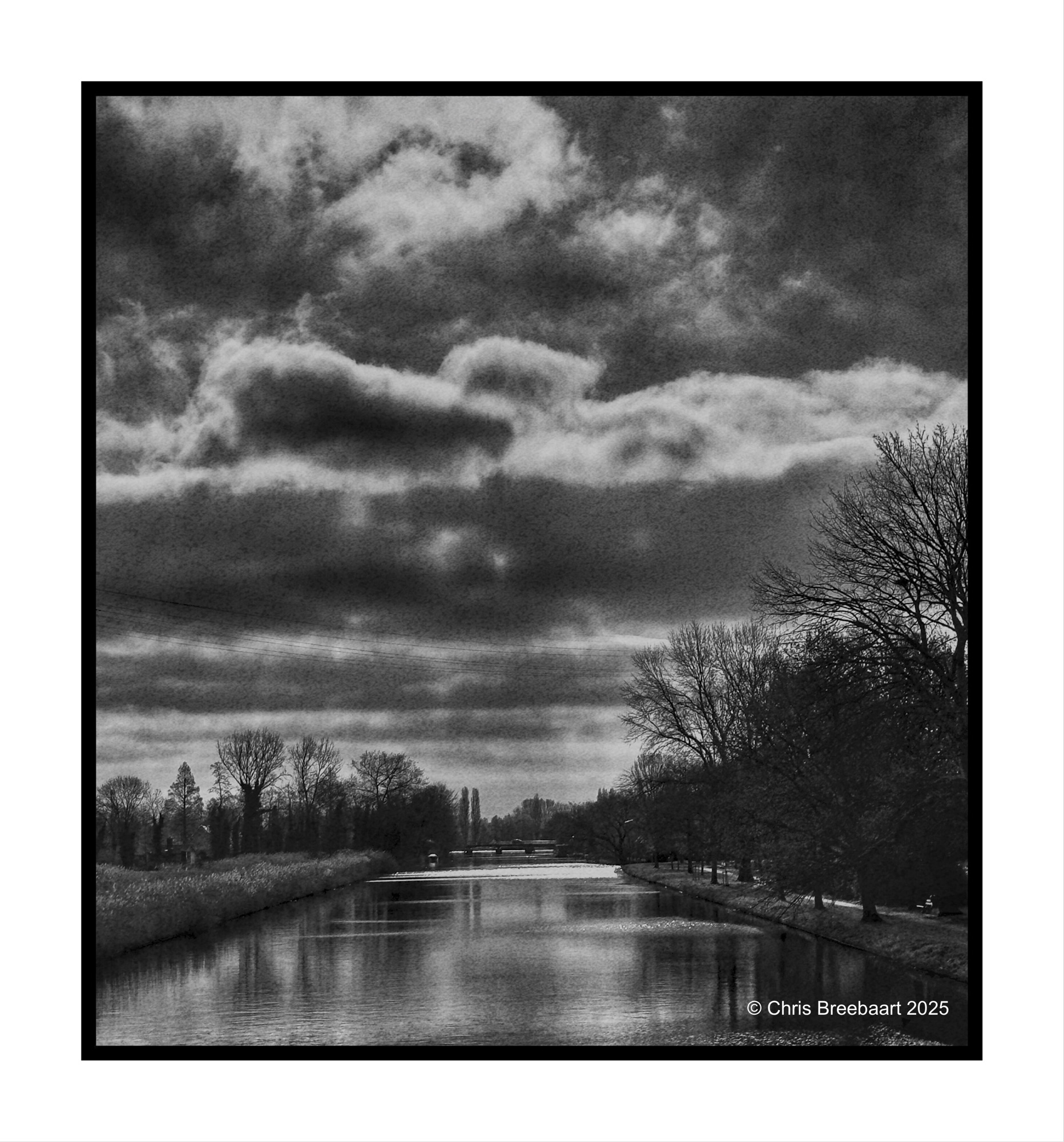
This week’s theme #390 is ‘color in black and white’. The theme focuses on the cognitive fact that our brains still know a color, even if it is in a grey tone. So the sky is blue, the grass green etc. Here you can see what colors do in greys, and if that is appealing or not to your taste pallet. For me this challenge is a bit of fun: most of the time I am looking at the world translating colors straight into grey tones, seeing if a photo is working in monochrome or not. Thanks Egidio for this challenge.
If you visit my blog – like I hope you do or from now start to do – you must have recognized my ‘old’ love for monochrome. When I started this hobby, mono was fashionable and a standard for news photography. And it was cheaper. In this series I offer you two versions of a photo. And you can prefer one over the other, or not.
If you visit my blog – like I hope you do or from now start to do – you must have recognized my ‘old’ love for monochrome. When I started this hobby, mono was fashionable and a standard for news photography. And it was cheaper. In this series I offer you two versions of a photo. And you can prefer one over the other, or not.
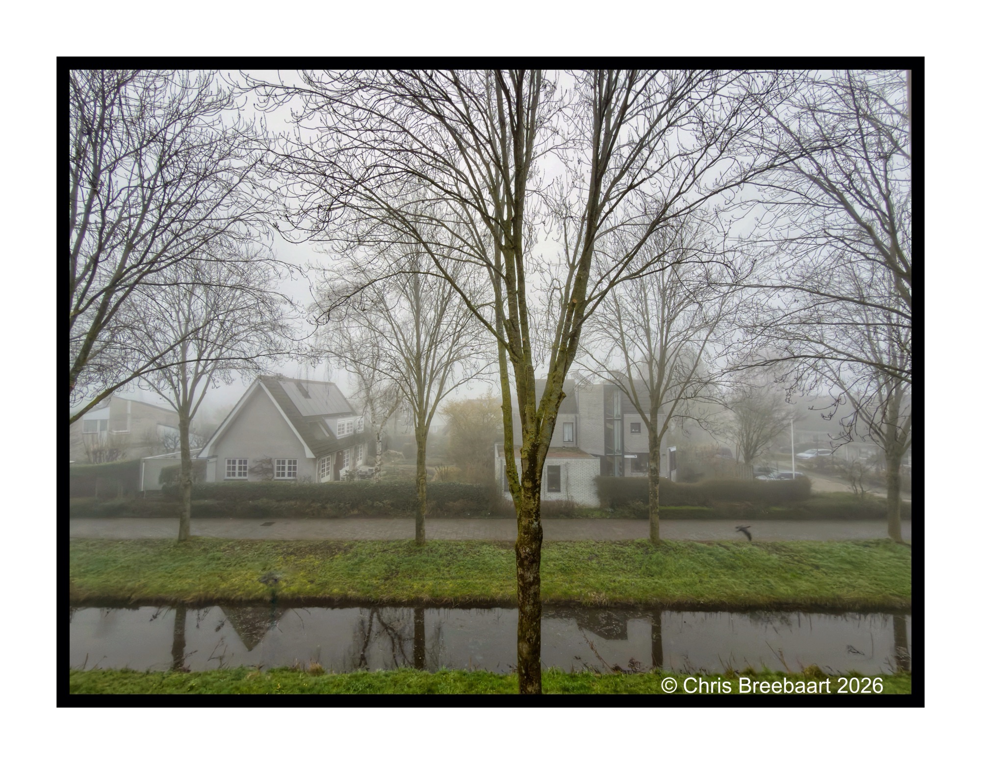
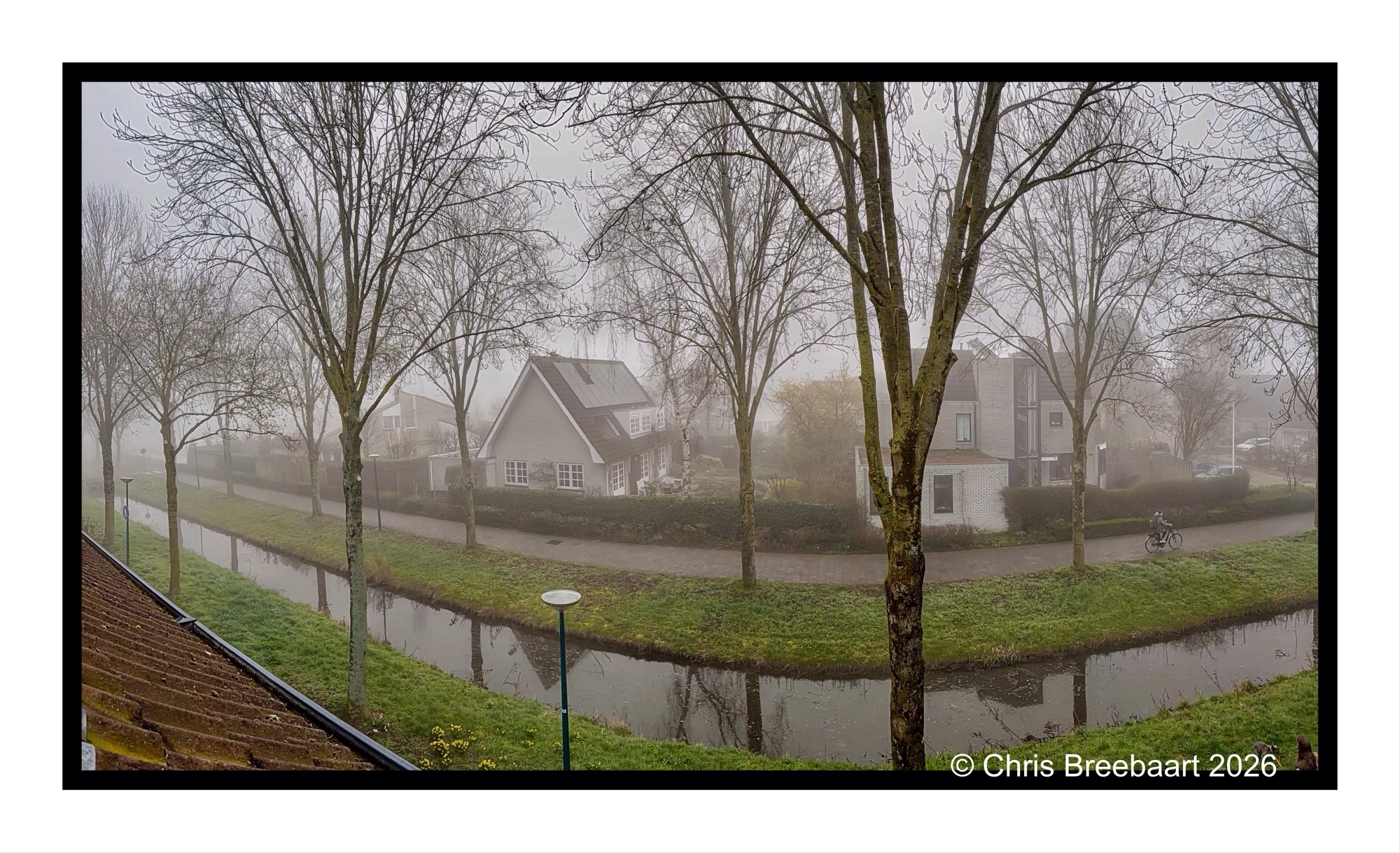
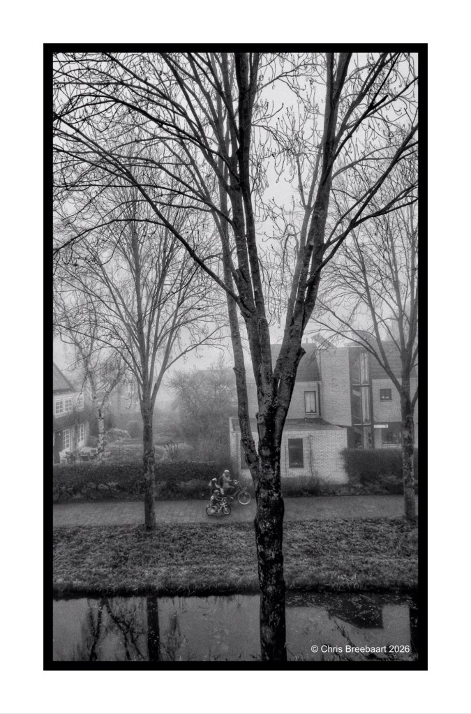
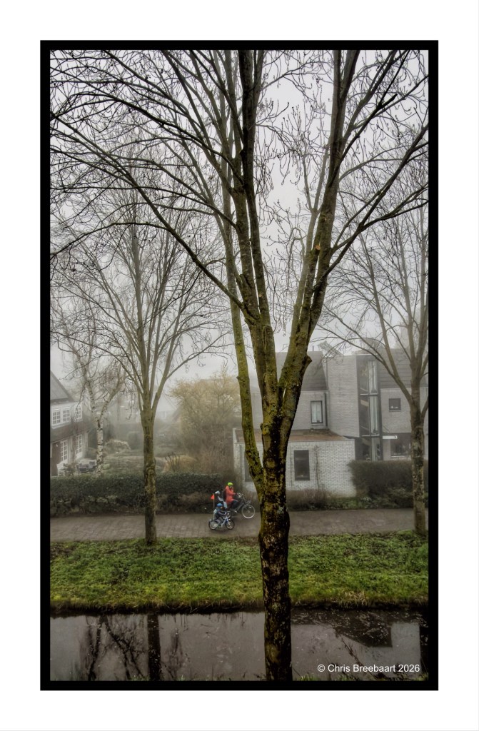
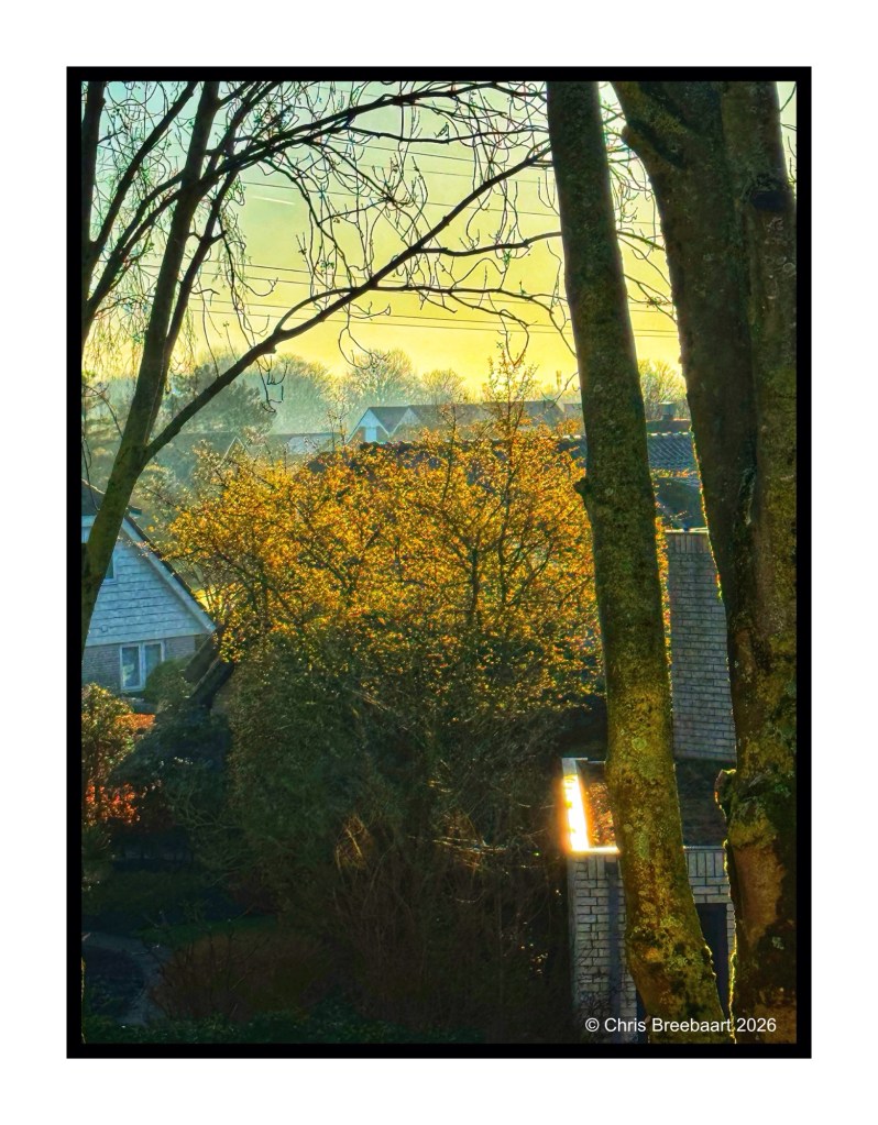
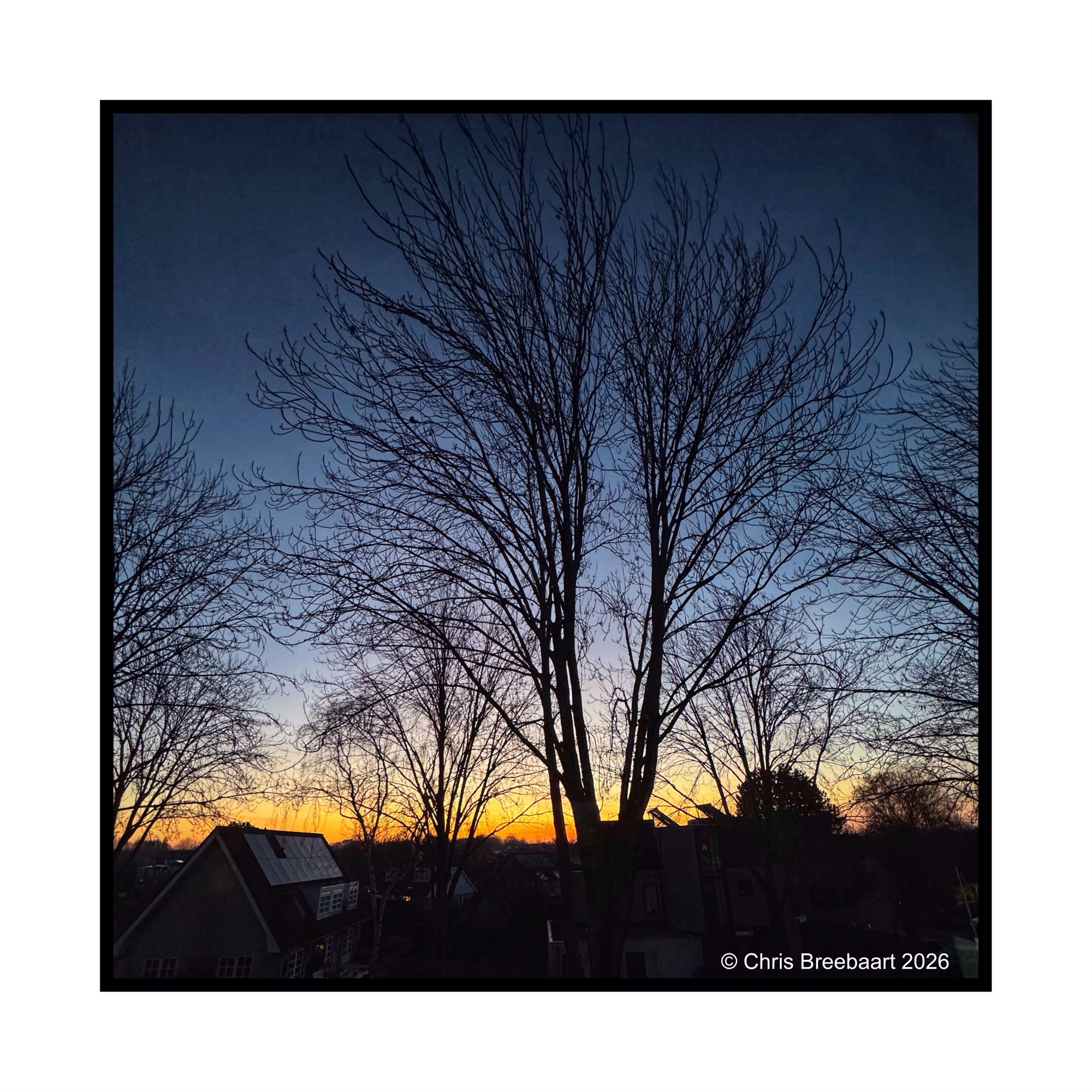
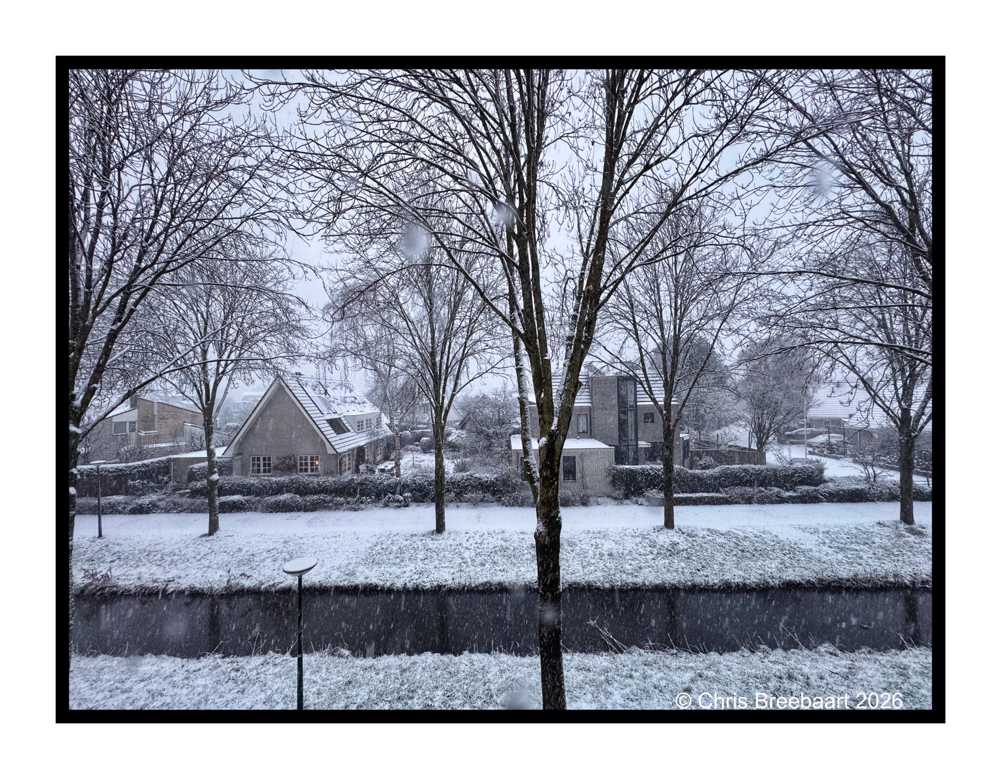
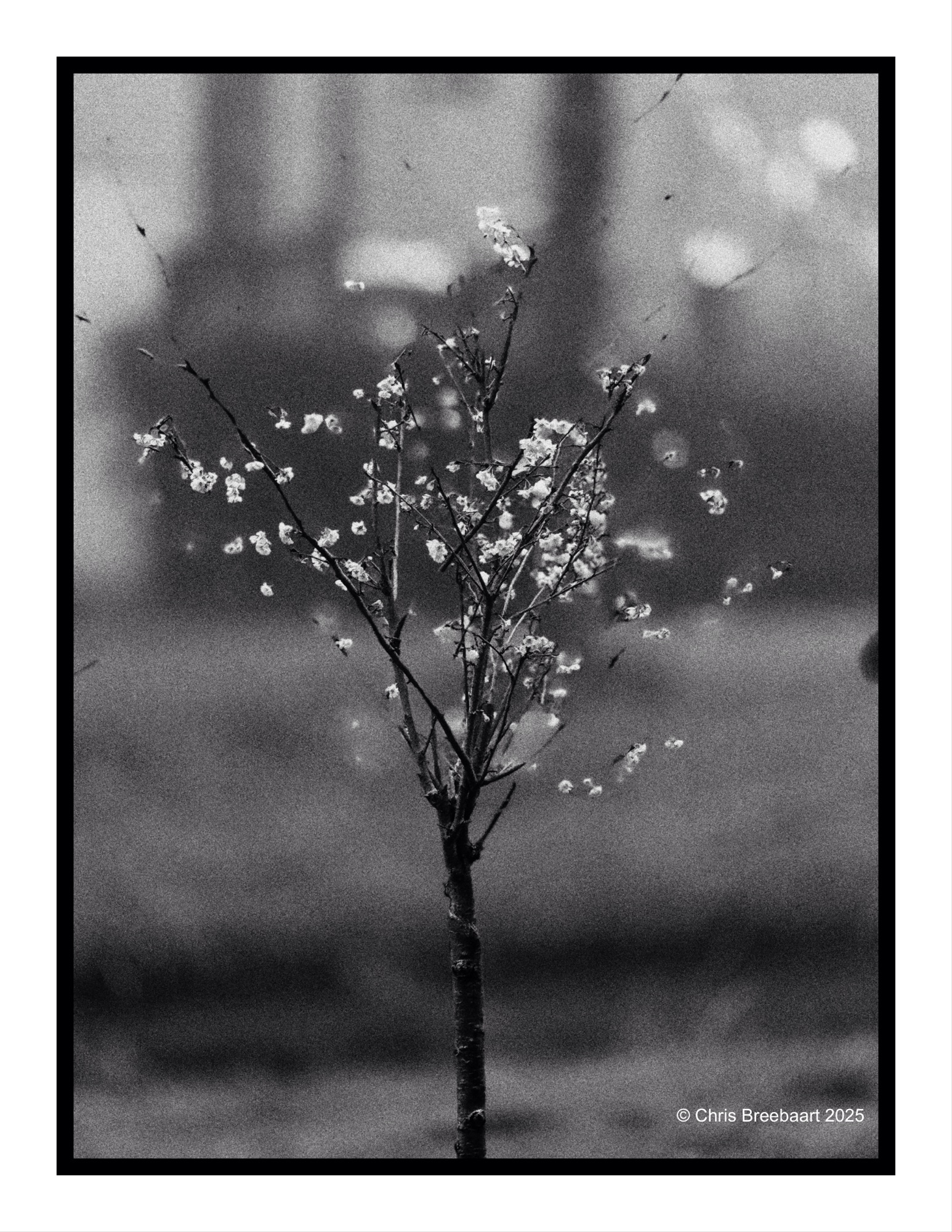
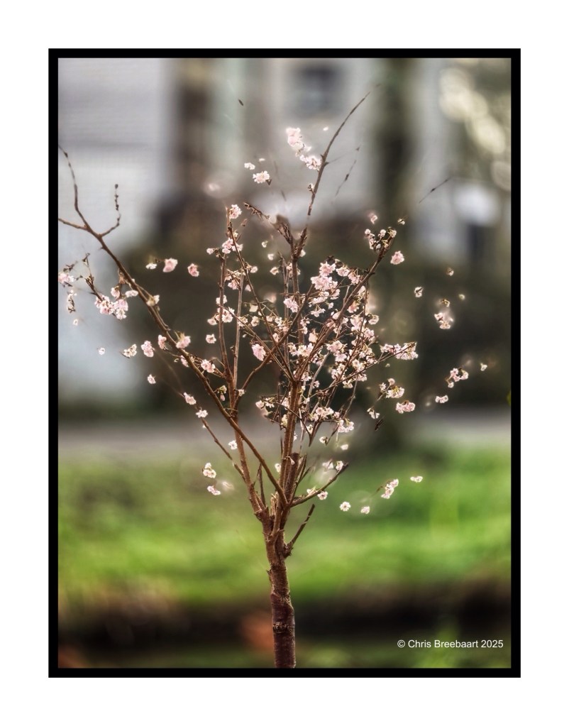
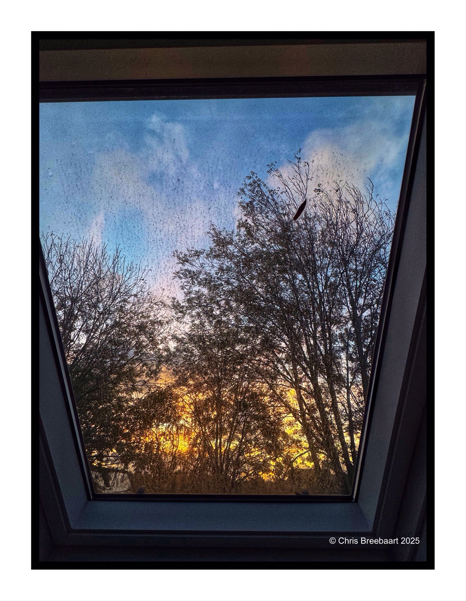
This week’s theme #390 is ‘color in black and white’. What an appropiate theme, to show the last of the series. A view out of the window. Egidio’s theme focused on the cognitive fact that our brains still know a soccer pitch is green, even in grey tones. Here you can see what colors do in greys, and if that is appealing or not to your taste pallet.
If you visit my blog – like I hope you do or from now start to do – you must have recognized my ‘old’ love for monochrome. When I started this hobby, mono was fashionable and a standard for news photography. And it was cheaper. In this series I offer you two versions of a photo. And you can prefer one over the other, or not.
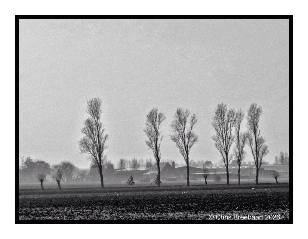
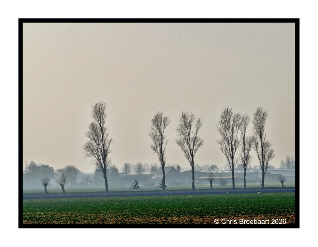
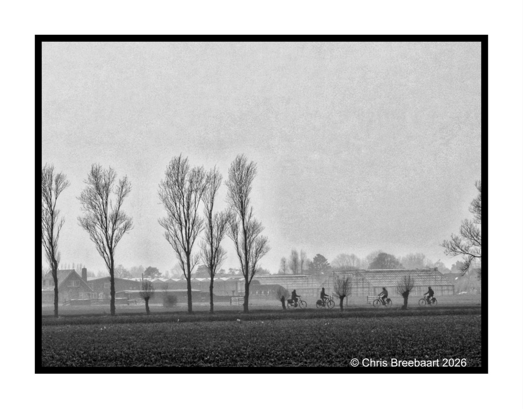
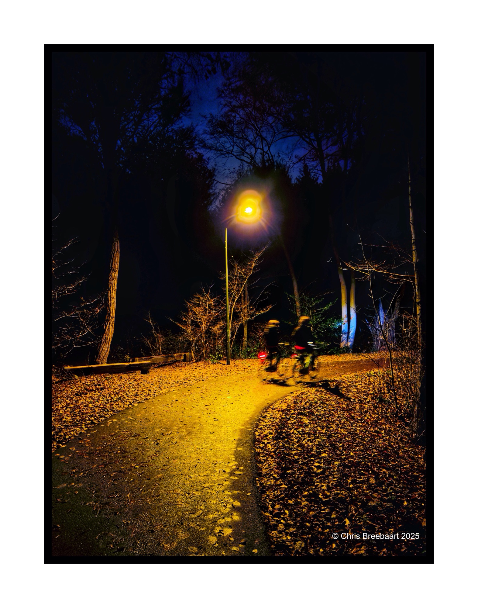
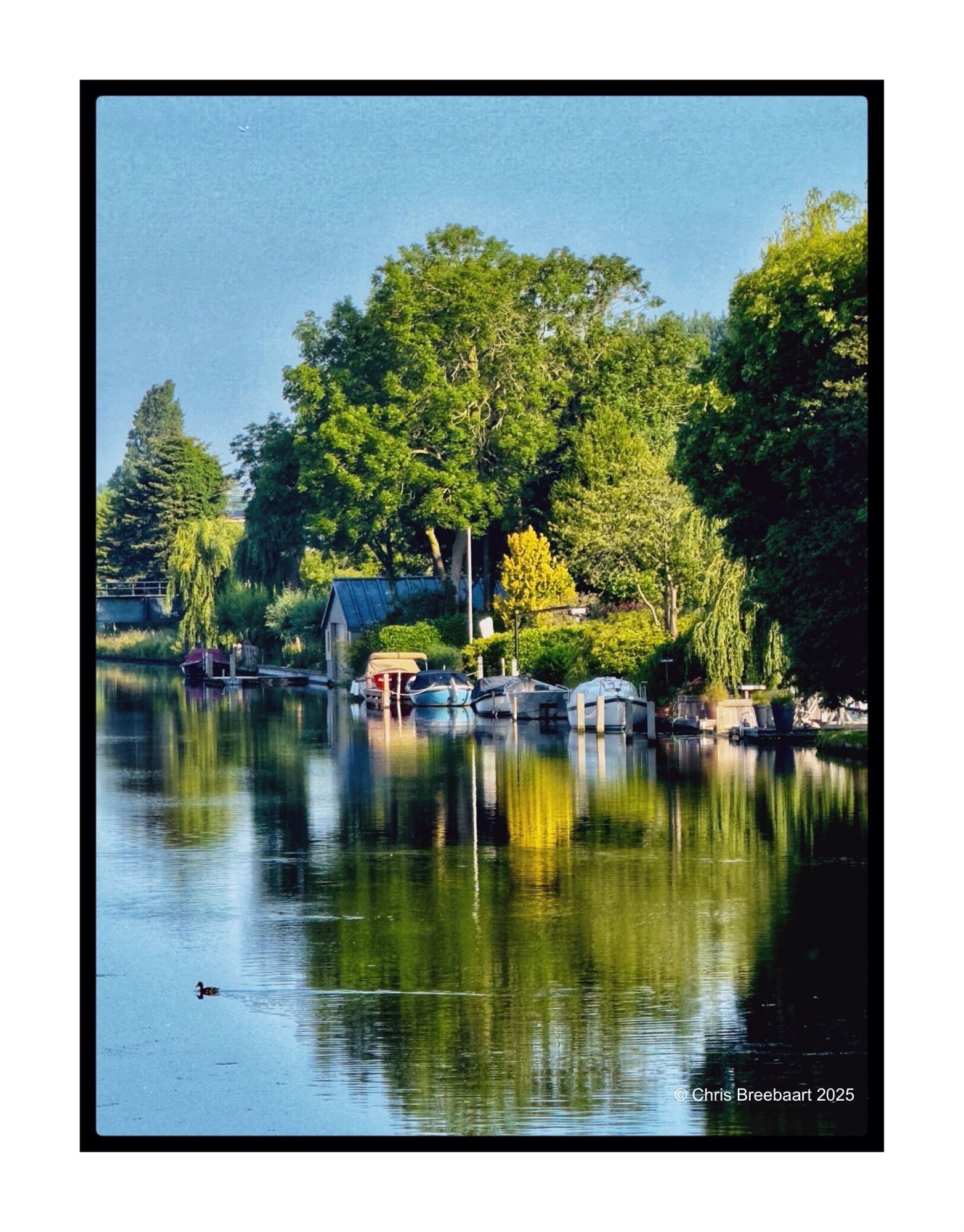
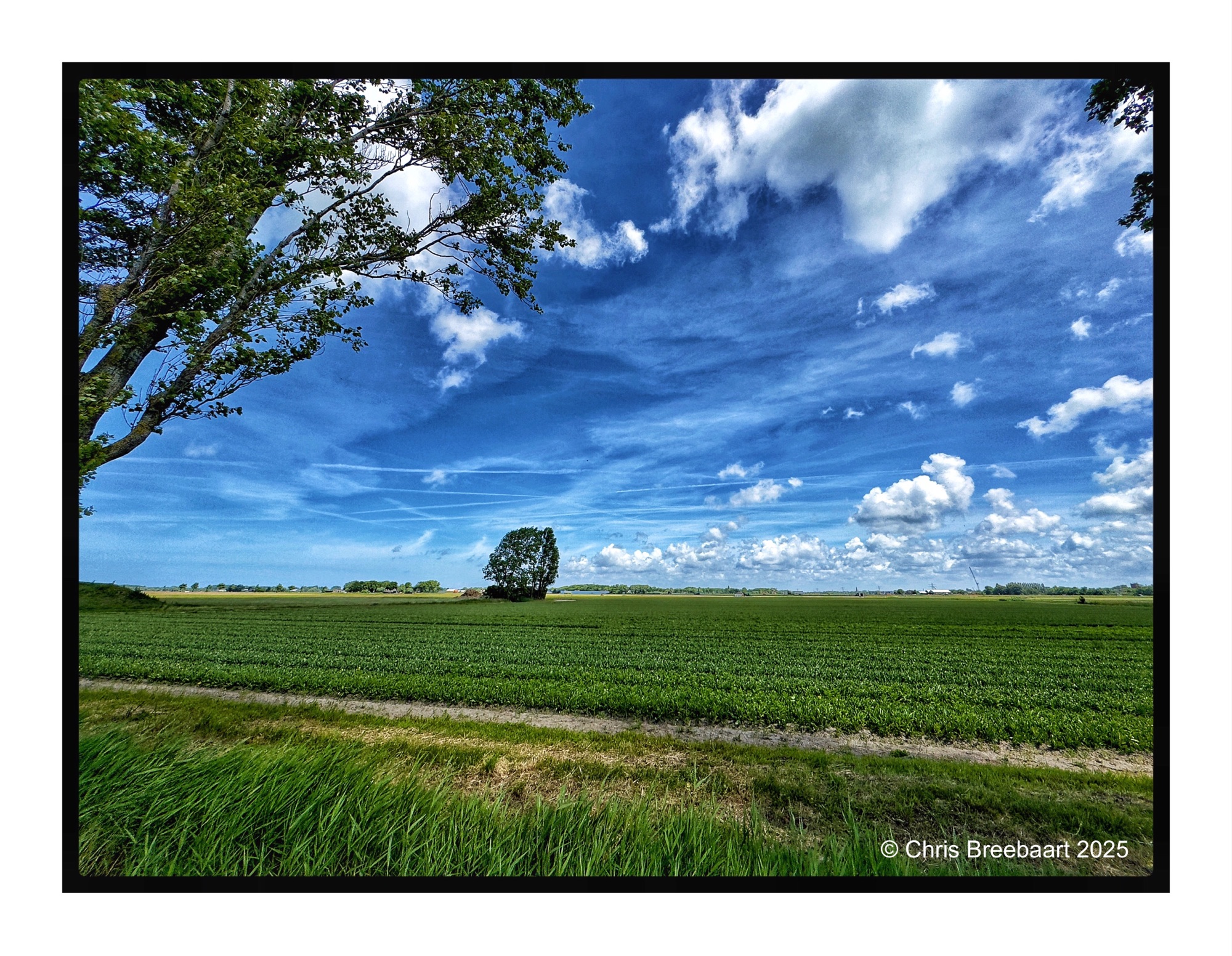
This week’s theme is ‘Time to relax’. On a bicycle ride through fields where soon bulb flowers will pop up, together with other cyclists. On the color version you can see the deep purple of early hyacinths. With Some yellow late Daffodils.
If you visit my blog – like I hope you do or from now start to do – you must have recognized my ‘old’ love for monochrome. When I started this hobby, mono was fashionable and a standard for news photography. And it was cheaper. In this series I offer you two versions of a photo. And you can prefer one over the other, or not.
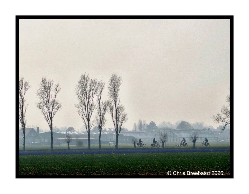
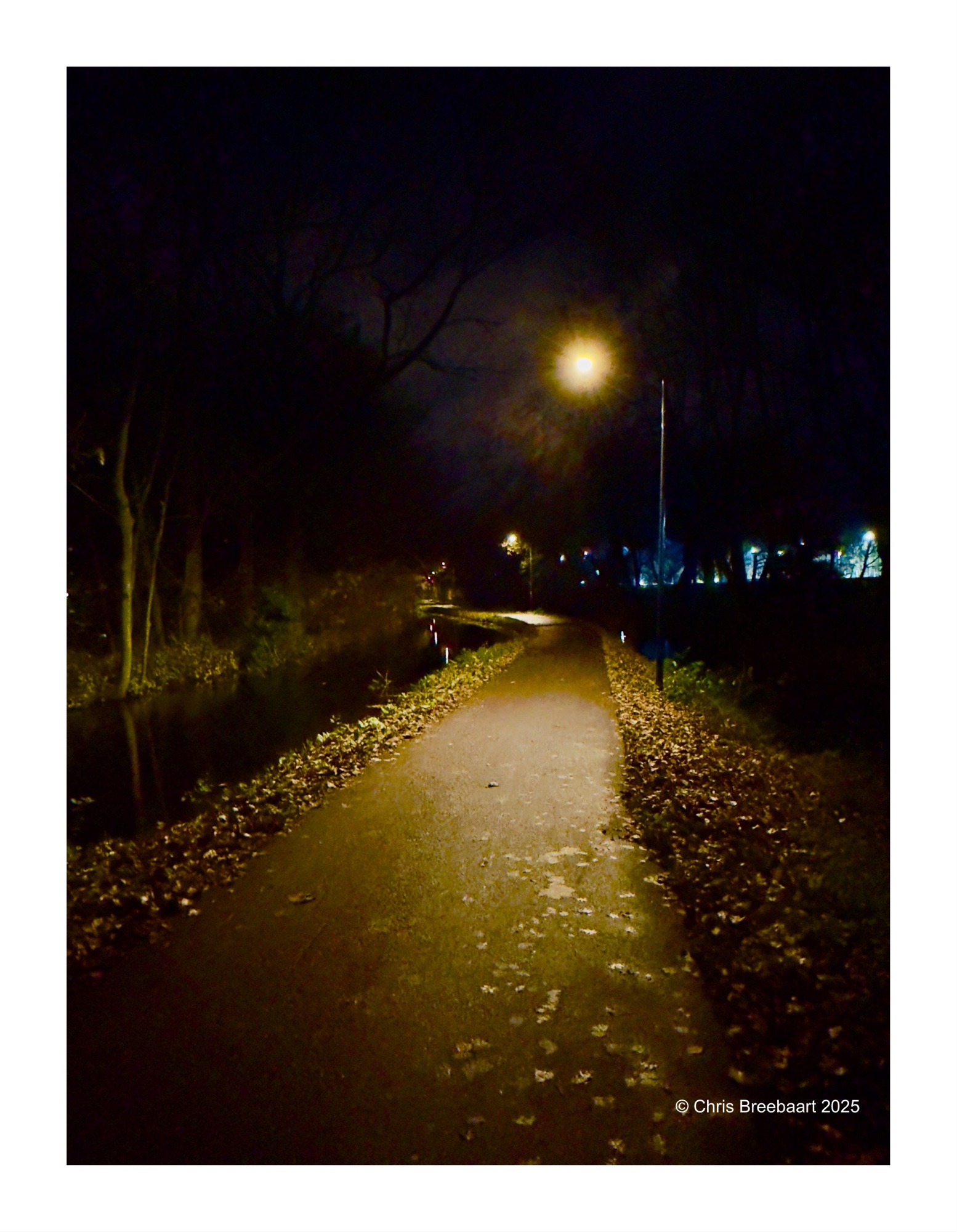
This week’s theme is ‘Time to relax’. On a bicycle ride through fields where soon bulb flowers will pop up, together with other cyclists. On the color version you can see the deep purple of early hyacinths. With Some yellow late Daffodils.
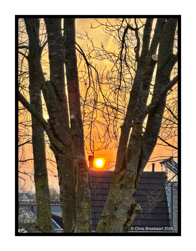
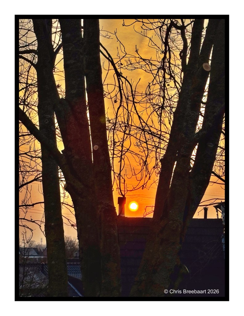
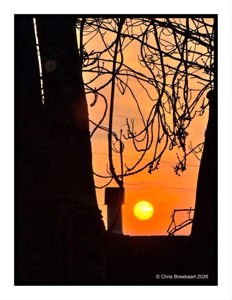
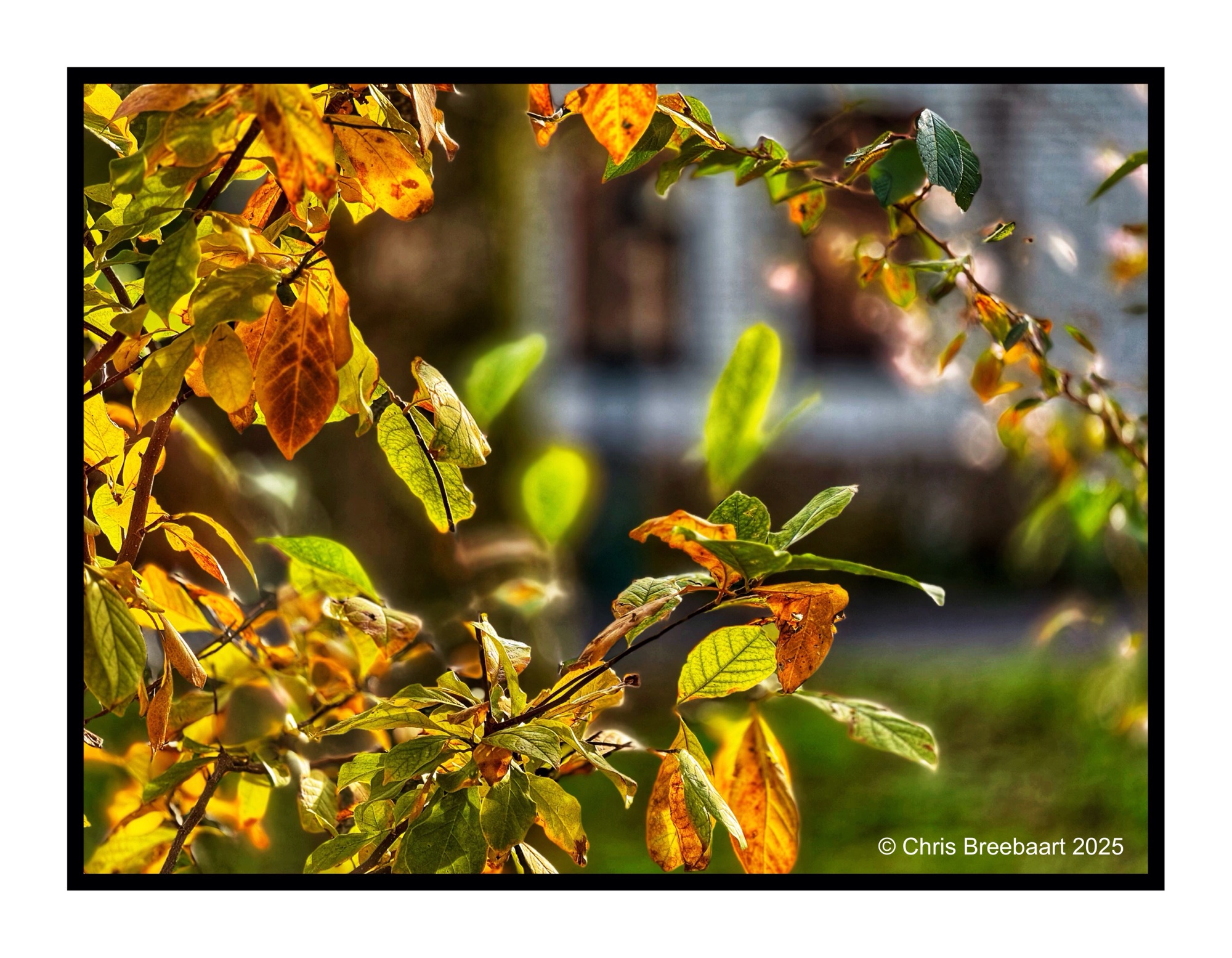
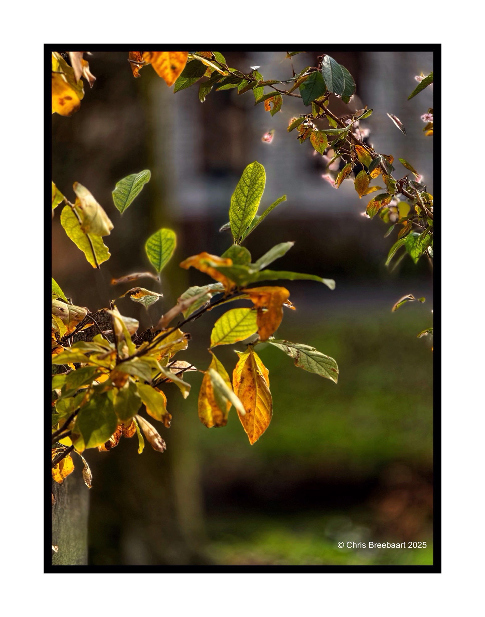
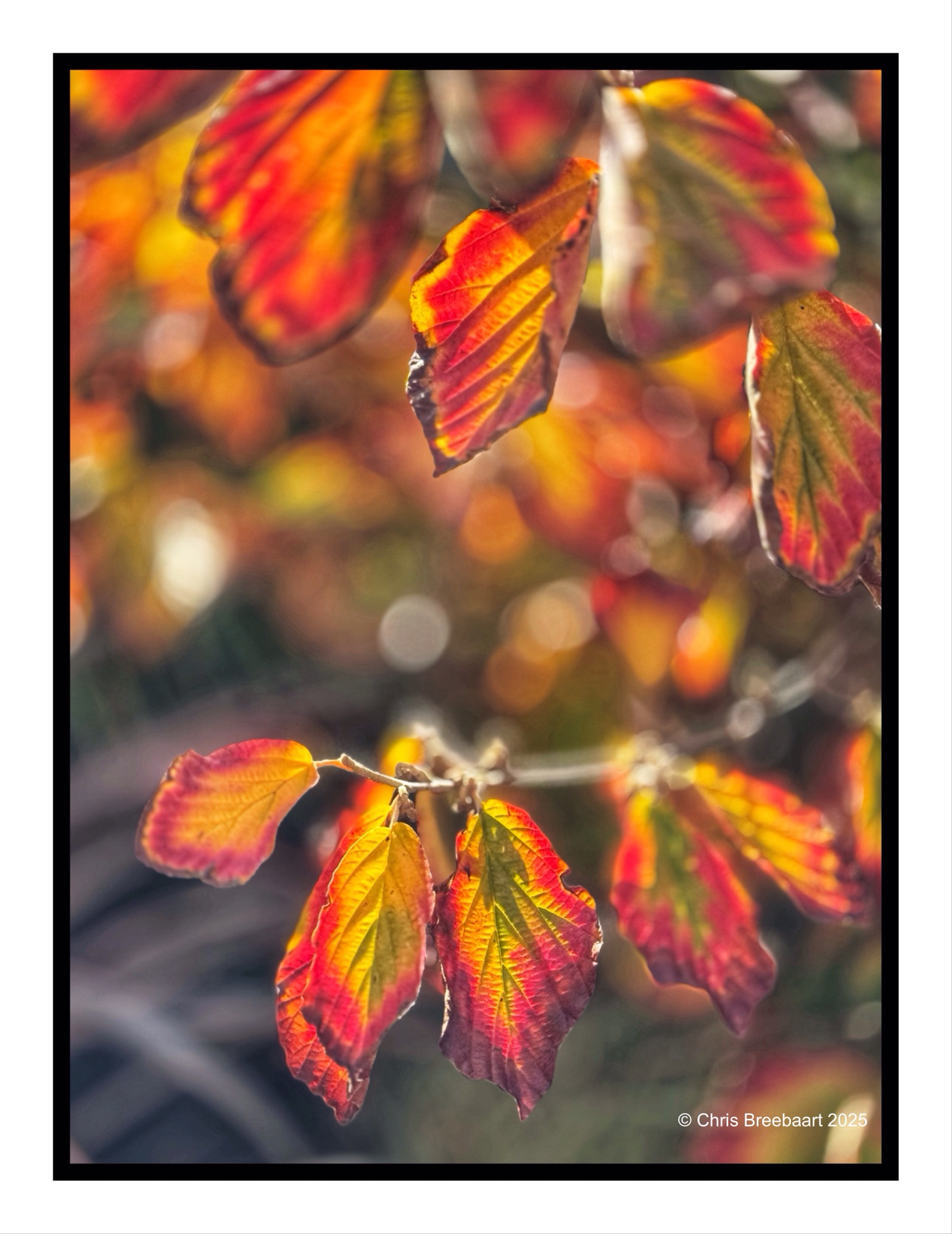
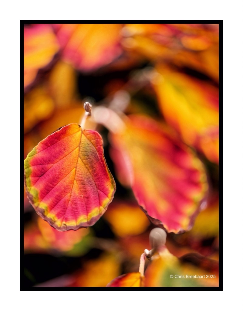
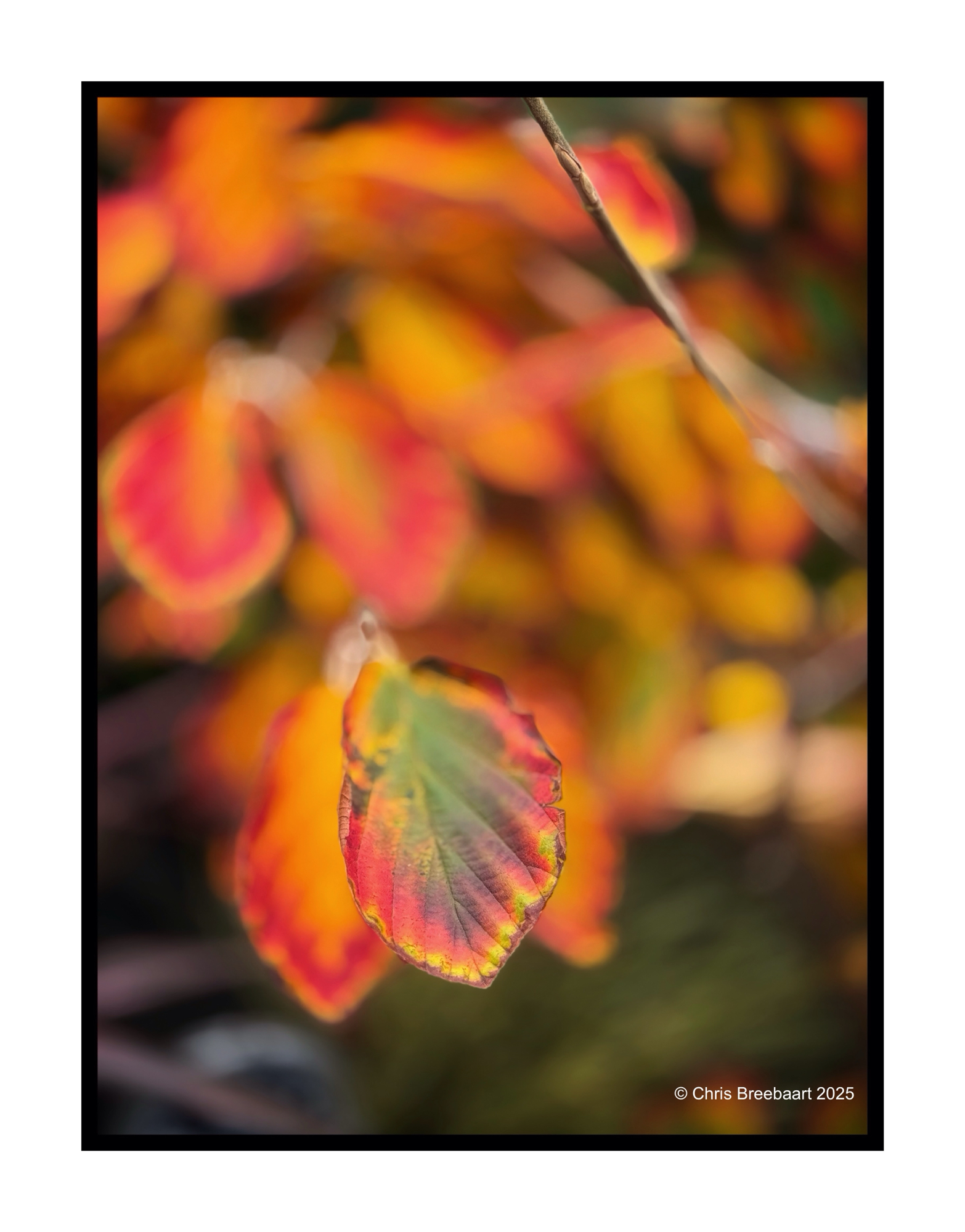
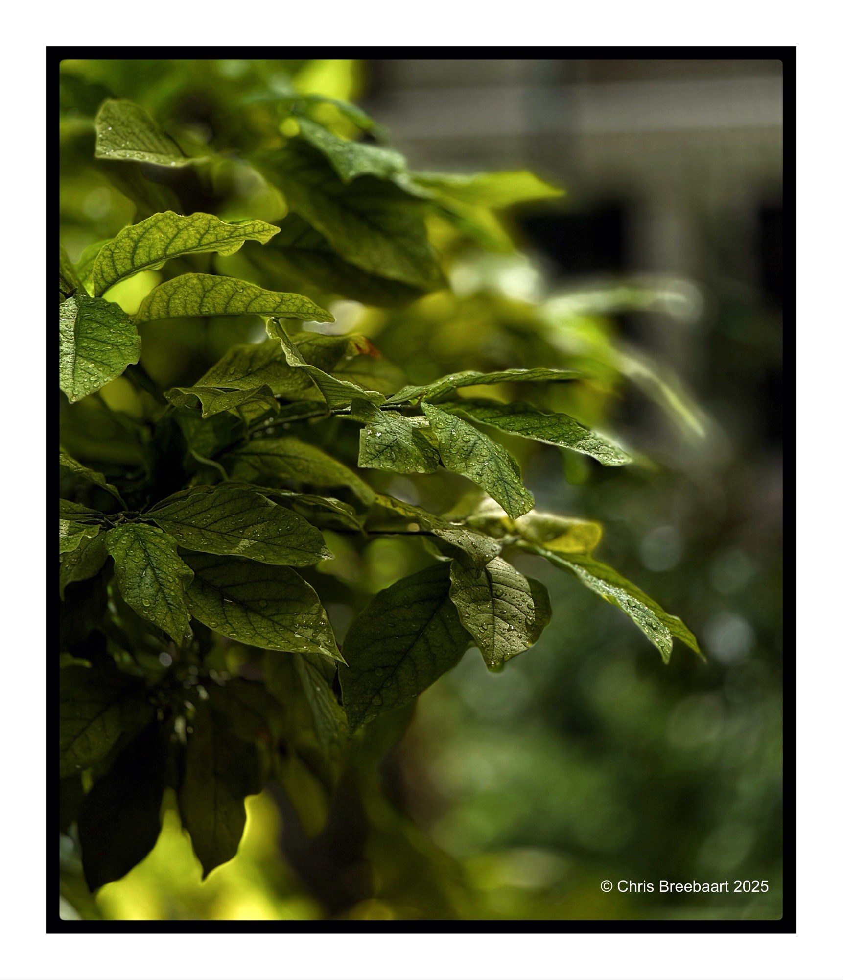
Spring knocks on the door. Sunrises through young leaves, creating golden slumbers in the early sunlight. Vanishing as the sun climbs higher in the sky.
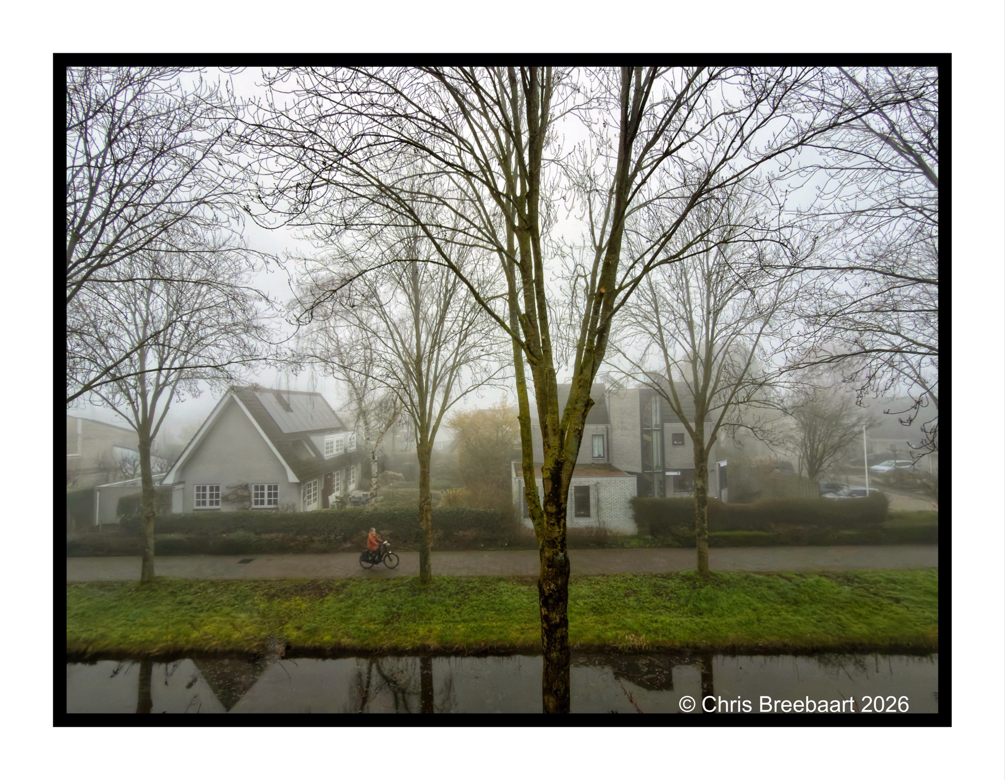
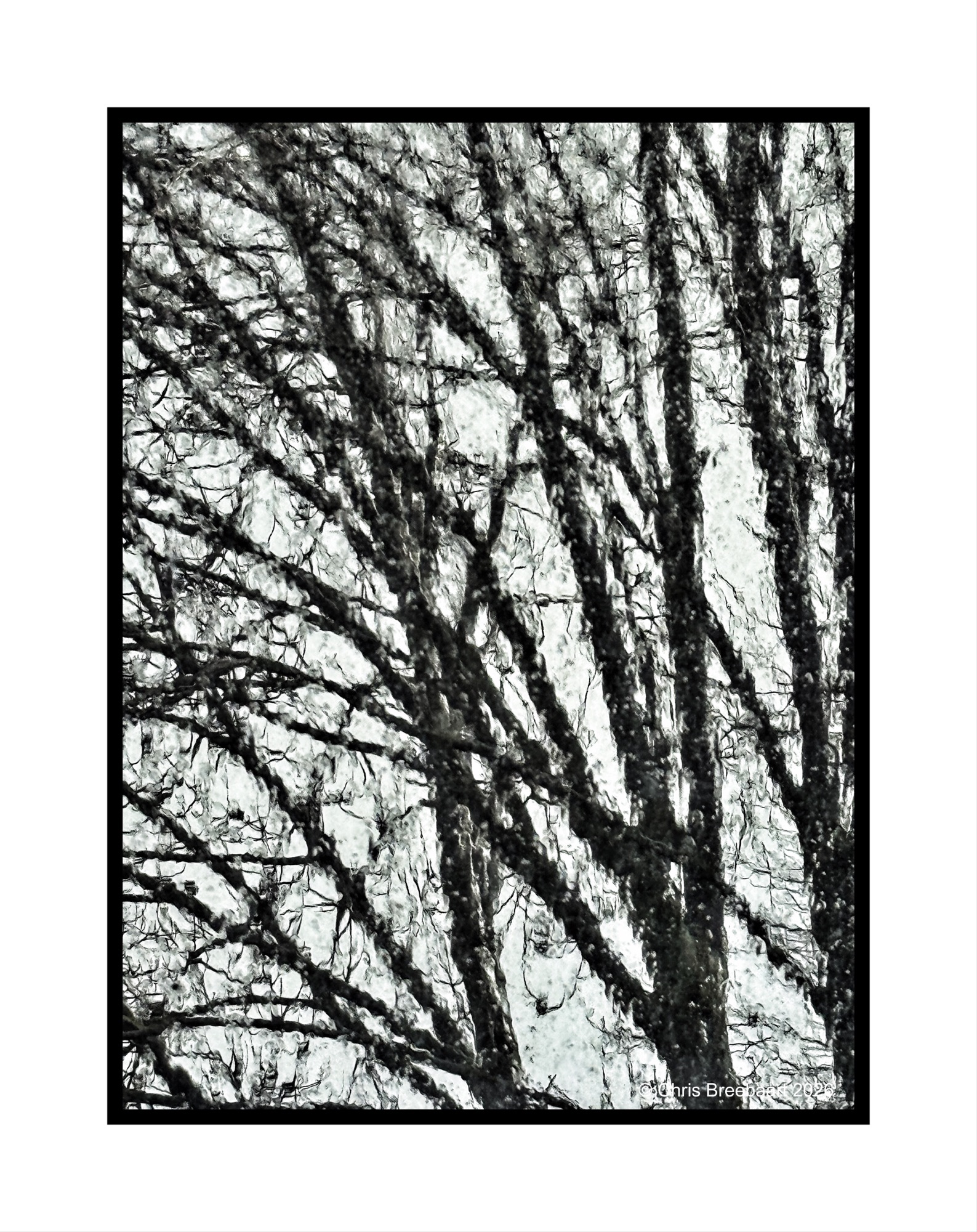
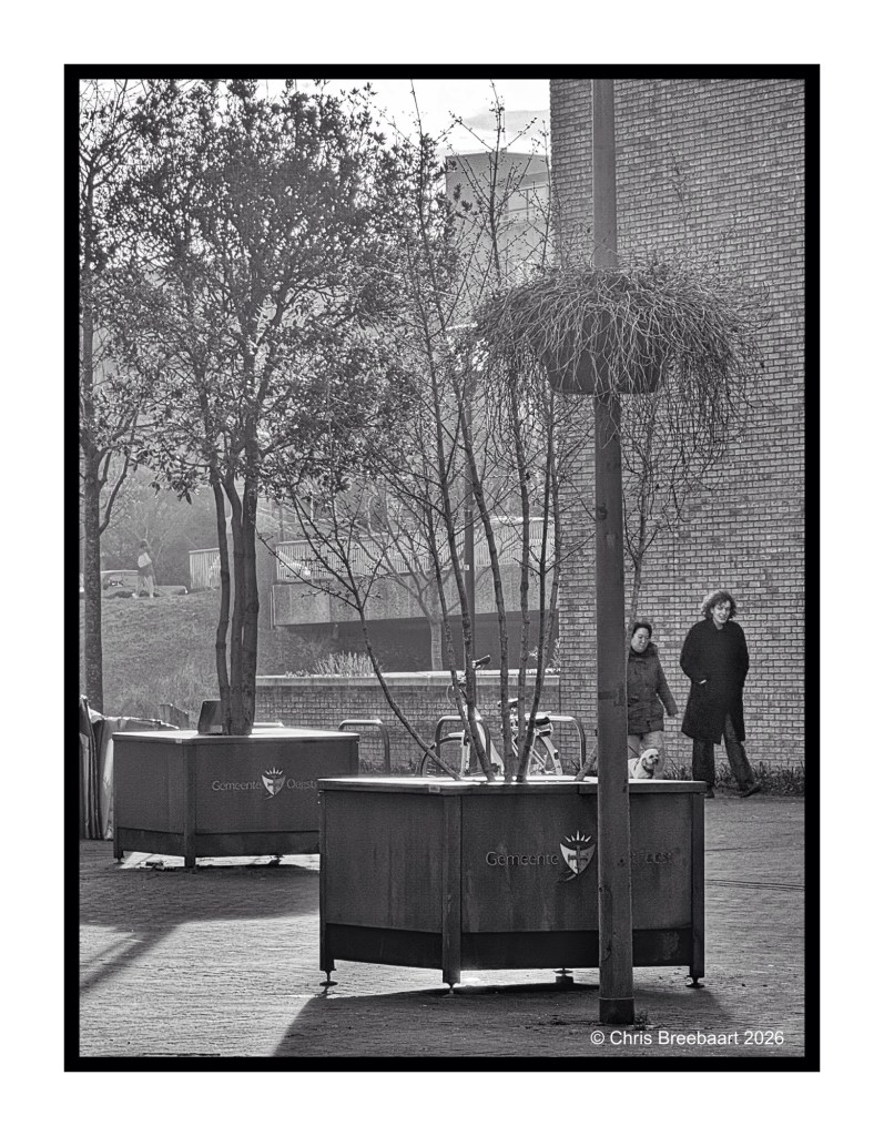
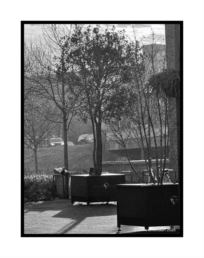
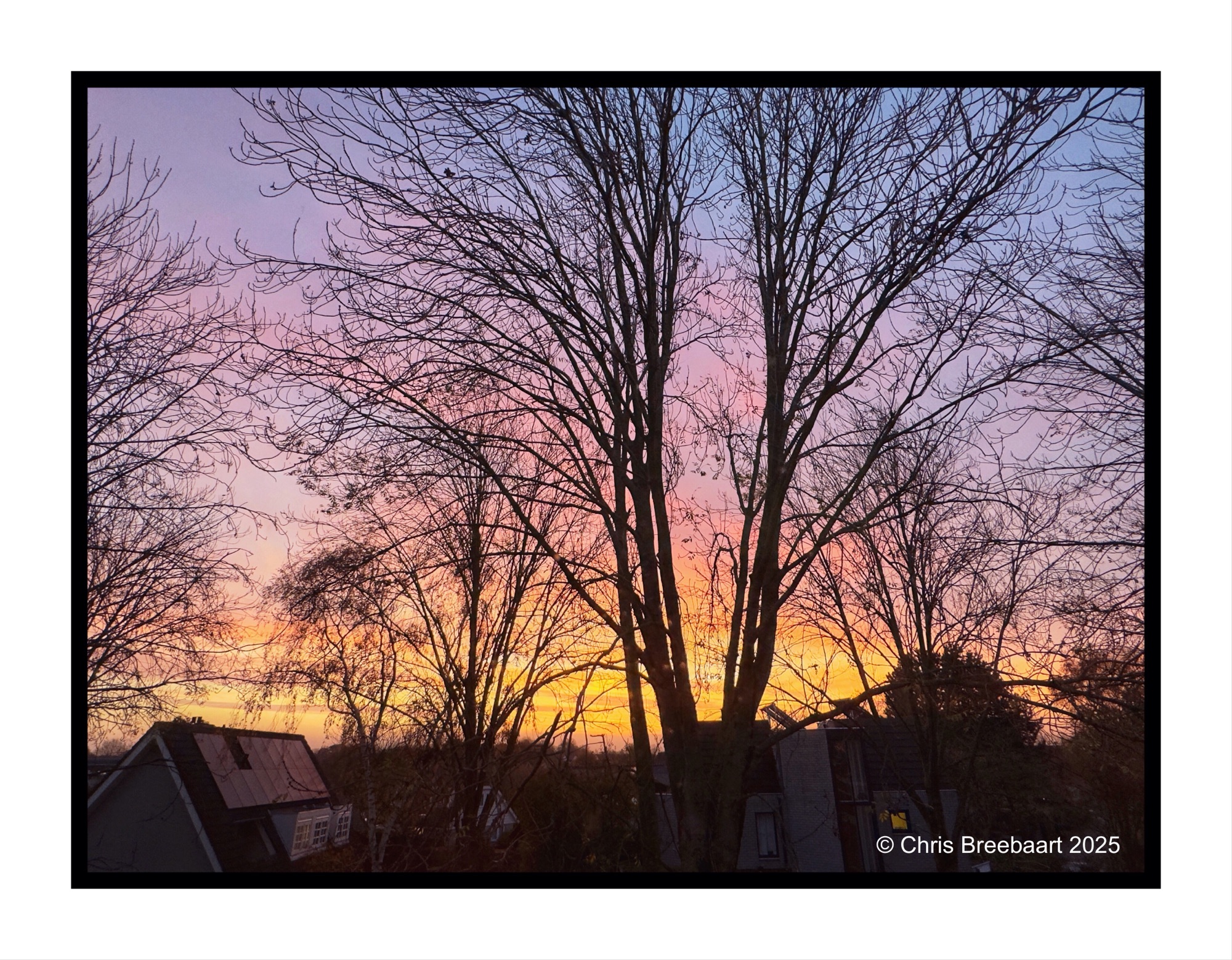
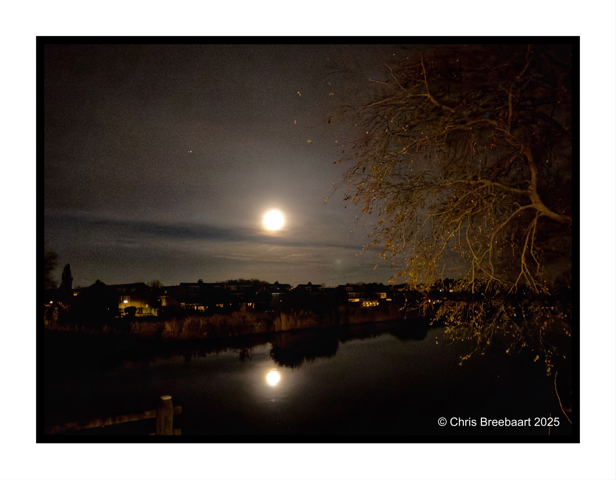
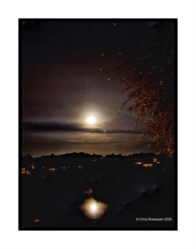
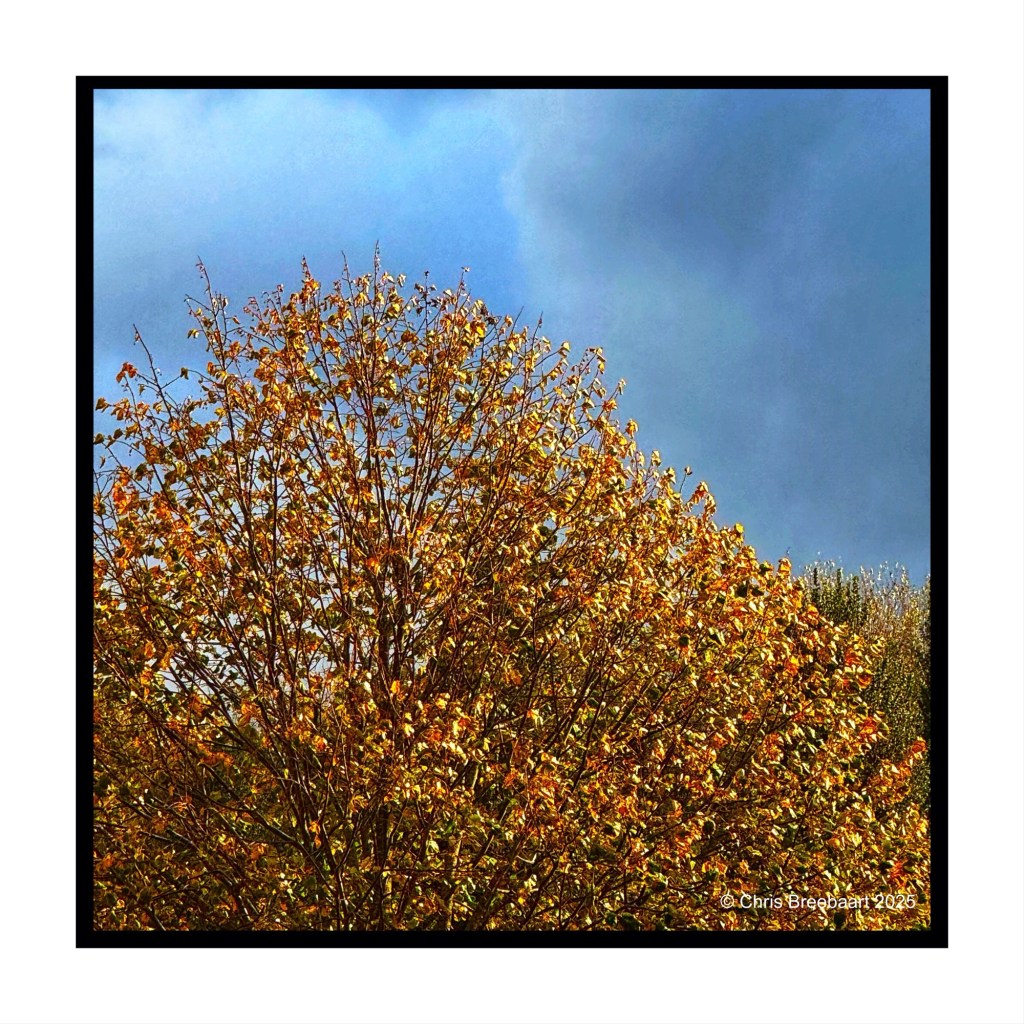
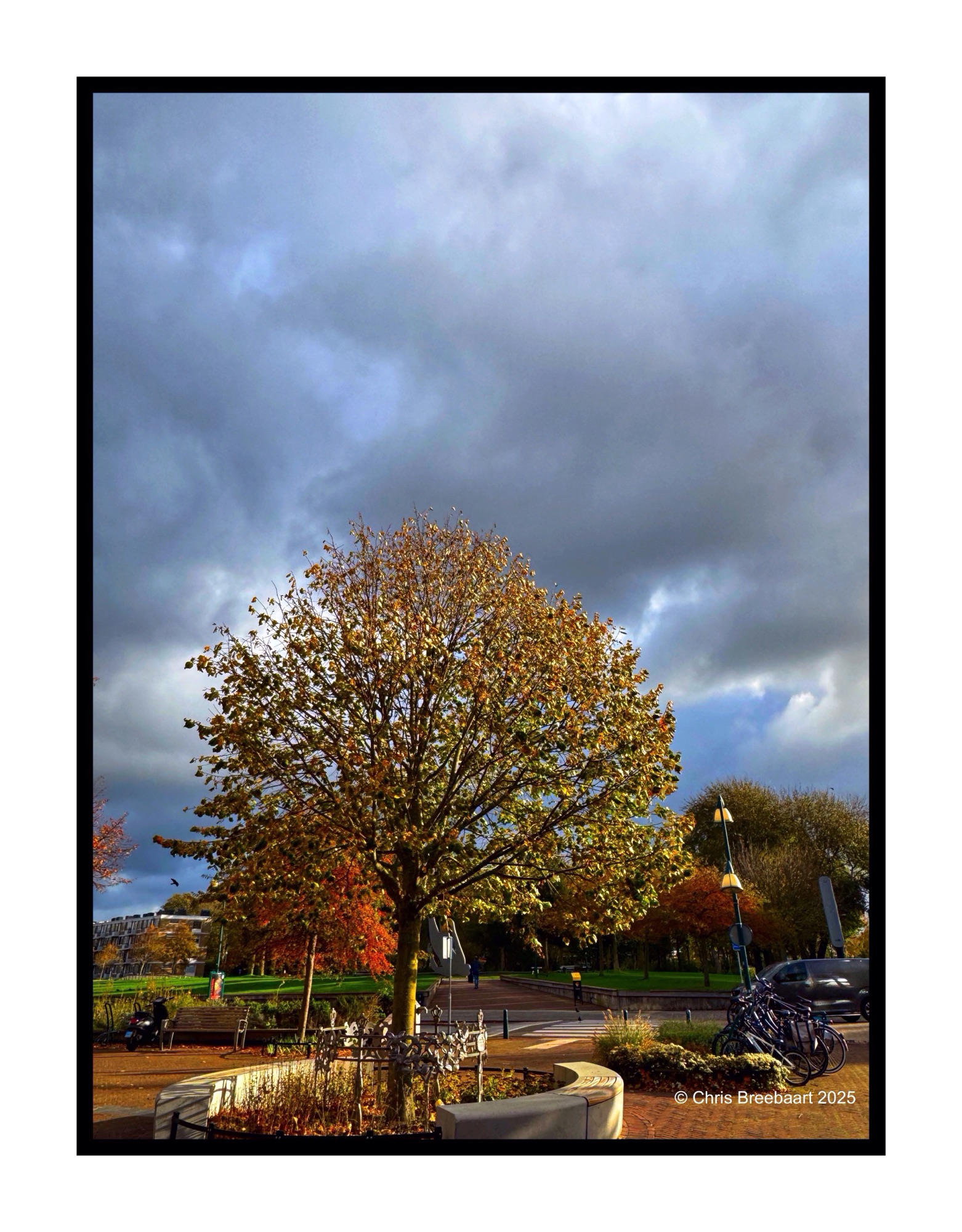
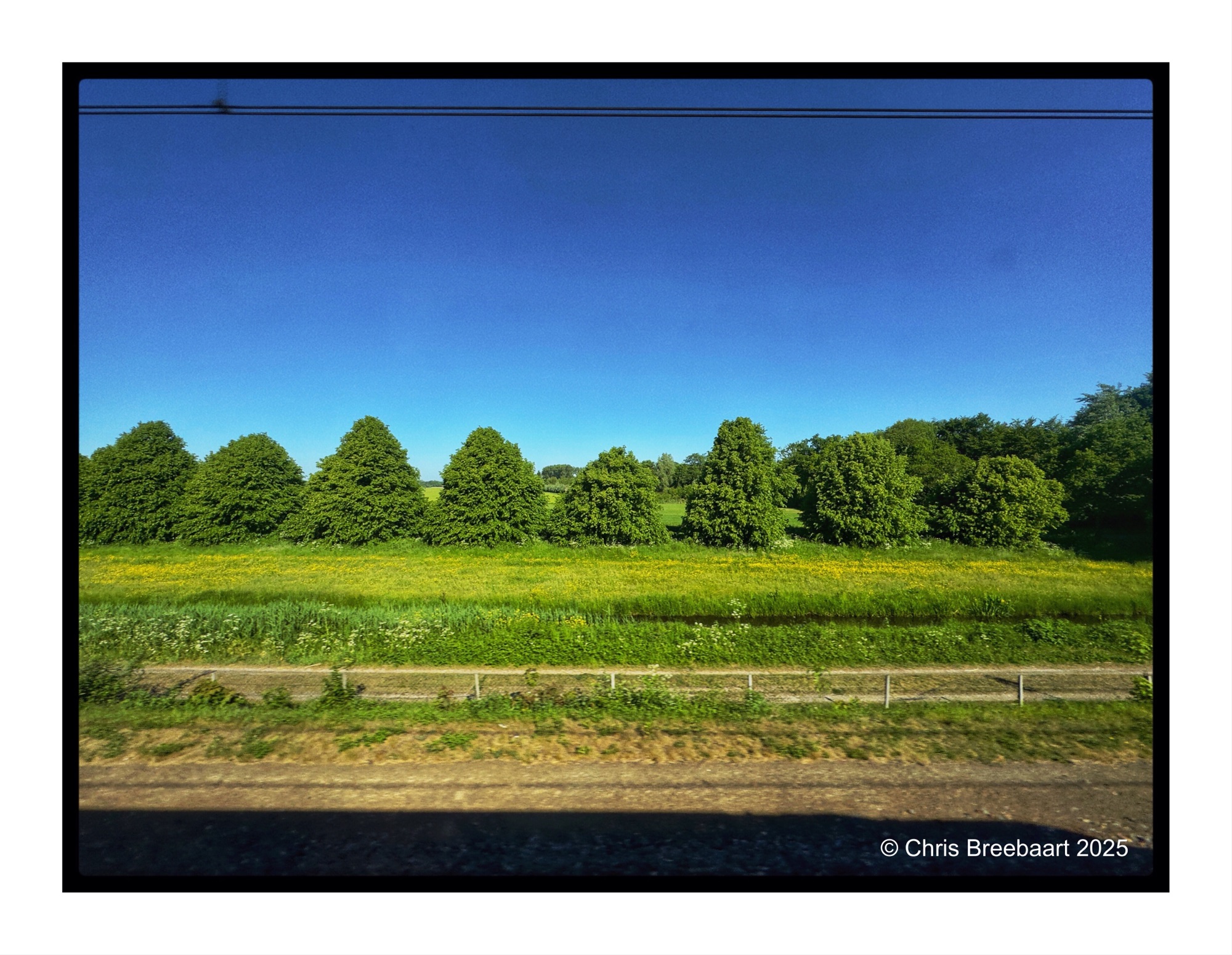
LAPC #386 invites to use the power of juxtaposition. I give the brief a bit more room for experiment, and put two pictures next to another. They both have a narrative of their own. It is basically the same subject (trees) but framed in a different way.
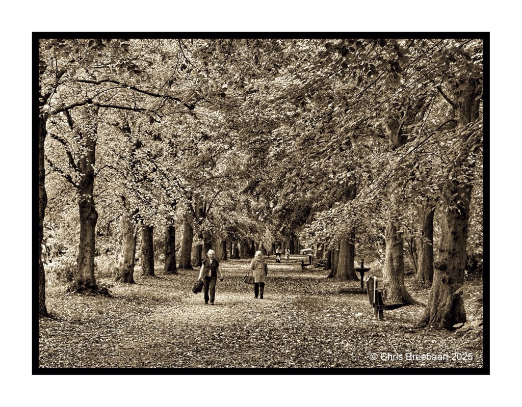
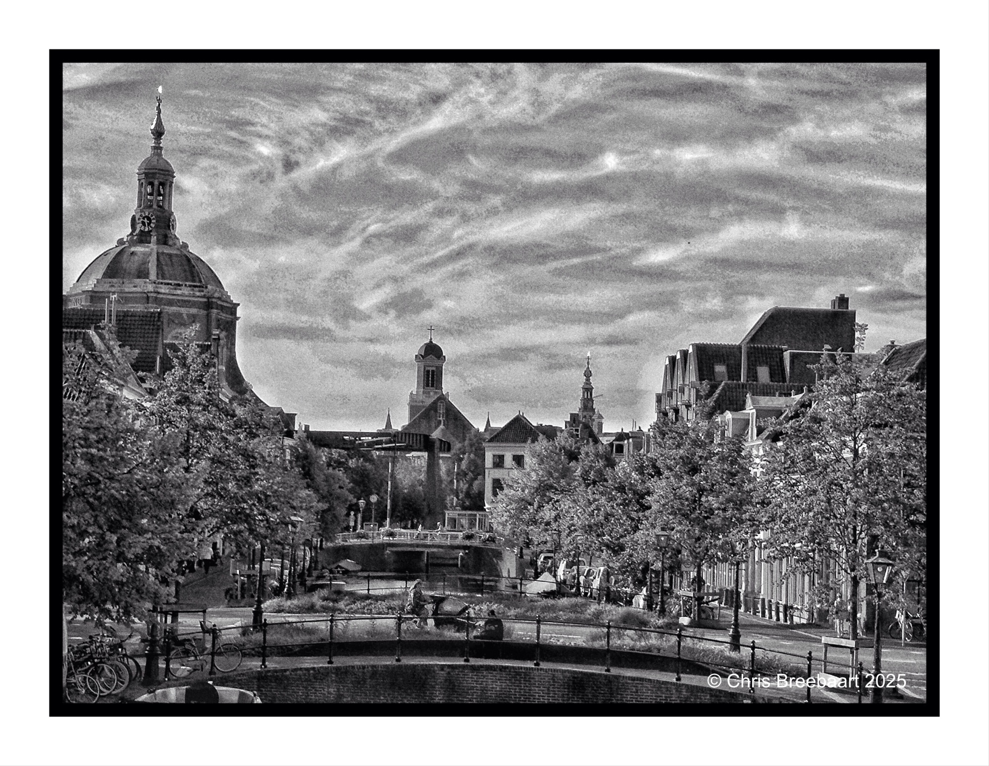
A more detailed view of the photo I published yesterday of Leiden. Leiden used to be famous for fabrics, and canals provided the infrastructure for the logistics. Some of the canals were filled up in the second half of the 20th century. However, there are debates about opening a few of them again. These discussions focus on sustainability and environmental quality.